
Charttoolbox
- No match
Machine translation — the English original is authoritative.
The Story
I built Charttoolbox because many everyday charting tasks are too small for a full BI project, but still deserve a clear, polished result.
I often found that turning a simple spreadsheet into a useful chart required too many steps: cleaning the data, choosing the right chart type, adjusting settings, and sometimes uploading the file to an unfamiliar service. I wanted a faster workflow that stayed focused on the actual question in the data.
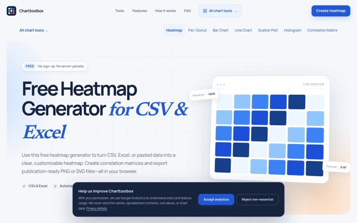
Charttoolbox lets you upload CSV, TSV, XLS, or XLSX files—or simply paste a table—and turn the data into heatmaps, pie and donut charts, bar charts, line charts, scatter plots, histograms, and correlation matrices. It detects suitable fields, lets you correct the mapping, and exports the finished chart as PNG or SVG.
The spreadsheet contents are processed locally in the browser, so the tool does not need to upload the table to a server. My goal is to make small visualization tasks quick, understandable, and useful for analysts, marketers, students, and anyone working with spreadsheet data.
AI Overview
AI-generatedSpreadsheet visualizations typically fall into a frustrating middle ground: too simple for dedicated business intelligence platforms, yet tedious enough that they demand a dedicated tool. This browser-based heatmap and charting application addresses that exact gap, offering analysts, researchers, and data-curious professionals a fast route from raw data to polished visuals without the friction of traditional charting software.
The core value proposition centers on speed and simplicity. Users paste or upload spreadsheet data—supporting CSV, Excel, and TSV formats—and the application automatically detects the structure and suggests suitable visualization types. The interface presents seven chart options: heatmaps, bar charts, line graphs, pie and donut charts, scatter plots, histograms, and correlation matrices. Once imported, data remains in the browser and never touches a server, addressing privacy concerns that deter some users from cloud-based tools.
What distinguishes this offering from generic charting libraries is its intentional focus. Rather than overwhelming users with hundreds of parameters, the tool provides a curated set of controls designed for specific use cases. The heatmap functionality, positioned as the primary feature, includes automatic Pearson correlation calculation for researchers and color scales tuned for both clarity and color-blindness accessibility. Professional designers will appreciate the SVG export option alongside standard PNG output, allowing further editing in design tools when necessary.
The application targets three distinct workflows. Business users can quickly generate comparison charts for reports and presentations. Academics can calculate correlation matrices for research papers without touching statistical software. Data analysts can explore patterns and outliers through interactive pivoting and scaling, all without writing code. The live preview mechanism means changes appear instantly, eliminating the compile-and-wait cycle common in traditional charting tools.
Technical implementation reflects sound design principles. Smart defaults suggest sensible visualizations and color schemes immediately, reducing decision fatigue for casual users. The color palette options span sequential, diverging, and accessible formats with adjustable midpoints and limits. The upload capacity handles files up to 10 MB with 20,000 cells, sufficient for most analytic tasks that fall outside enterprise BI territory.
The product is entirely free and requires no account creation, positioning it as a no-risk option for users evaluating their workflow. The combination of local processing, professional output, and streamlined design makes this genuinely useful for the everyday charting tasks that consistently fall through the cracks of more elaborate platforms.
Founder Diary
DevlogThe maker hasn't posted a diary entry yet.
Key Features
Auto-Detection
Automatically detects data structure and suggests appropriate visualization types.
Multiple Chart Types
Supports heatmaps, bar charts, line graphs, pie/donut charts, scatter plots, histograms, and correlation matrices.
Browser Privacy
Data processing occurs locally in the browser with no server storage.
Professional Export
Offers SVG and PNG export options for design tool compatibility.
Accessibility Features
Color scales optimized for color-blindness and automatic Pearson correlation calculations.
Live Preview
Instant visual updates as users modify chart parameters and data.
Use Cases
-
1
Business Professionals
Quickly generate comparison charts for reports and presentations without learning complex BI platforms.
-
2
Academics and Researchers
Calculate correlation matrices and analyze data for research papers without statistical software.
-
3
Data Analysts
Explore patterns and outliers through interactive pivoting and scaling without writing code.
FAQ
Is my data safe when using this charting tool? ▾
What file formats can I upload? ▾
Can I export charts professionally? ▾
How much does it cost? ▾
Pricing
Entirely free web-based application with no account or login required.
Tech Stack & Tags
Discussion
No comments yet — be the first!
Join the conversation — sign up to comment.
Sign up freeCommunity Support
Boost this project on Sell With boost