BrixUI
The Story
AI Overview
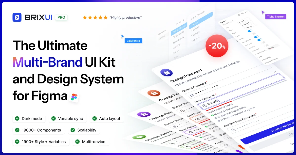
AI-generatedAt its core, BrixUI is a comprehensive design system that launches with substantial assets. The library includes nearly 19,000 components and variants, over 1,900 global styles and tokens, plus 1,800 page sections and ready-to-use templates. An additional 3,600 icons and logo packs—sourced from open-source collections and custom creations—provide supplementary materials that designers would otherwise need to source separately. This scale is designed to minimize the setup work before meaningful design work can begin.
What distinguishes BrixUI from commodity UI kits is its architecture. The system powers four distinct themes with light and dark mode variants, all built on a variable-driven structure. This approach allows designers to switch branding or color schemes globally without manually touching individual components, a meaningful productivity gain for teams managing multiple brands. The library prioritizes responsive design from the foundation, with breakpoints configured for mobile, tablet, desktop, and large desktop viewports, eliminating the common frustration of discovering layout issues across screen sizes late in the process.
The "reverse styling" feature is particularly noteworthy. Components are designed to adapt seamlessly to any background color or image, a detail that generic UI kits often overlook. Scalability is embedded as well, with components dynamically adjusting based on configurable body font sizes to maintain proportional relationships. The inclusion of pre-built page sections and widget templates positions these as ready-to-use examples rather than blank starting points.
The product has attracted over 200 creators, with version 1.2 recently launched, suggesting active development. Pricing and business model specifics are not detailed in available materials. For design teams operating across multiple brands or seeking to reduce component building overhead, BrixUI presents a feature-rich toolkit with deliberate architectural choices backing its scale.
Key Features
Component Library
Includes nearly 19,000 components and variants with 1,800 page sections and pre-built templates.
Multi-Brand Themes
Powers four distinct themes with light and dark mode variants and variable-driven structure for global switching.
Responsive Design
Configured with breakpoints for mobile, tablet, desktop, and large desktop viewports.
Reverse Styling
Components automatically adapt to any background color or image without manual adjustment.
Dynamic Scaling
Components adjust proportions based on configurable body font sizes.
Design Assets
Includes 3,600 icons and logo packs from open-source and custom collections.
Use Cases
-
1
Freelance Designers
Accelerates project timelines without reinventing basic components.
-
2
Design Agencies
Manage multiple brand variations efficiently with global branding and color scheme switching.
-
3
In-House Design Teams
Reduces component building overhead and minimizes setup work before meaningful design work.
-
4
Multi-Brand Enterprises
Ensures design consistency and responsive layouts across all brand variations and screen sizes.
FAQ
How many components does BrixUI include? ▾
Can I use BrixUI for multiple brands? ▾
Is BrixUI responsive? ▾
Does BrixUI support dark mode? ▾
Tech Stack & Tags
Discussion
No comments yet — be the first!
Join the conversation — sign up to comment.
Sign up freeCommunity Support
Boost this project on Sell With boost