
Nuxt UI v4
The Story
AI Overview
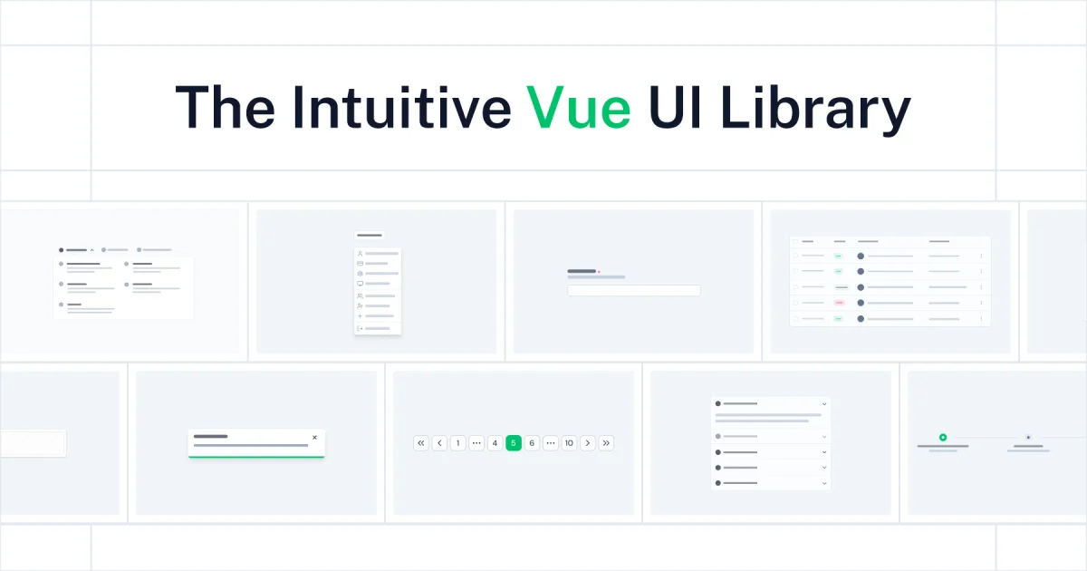
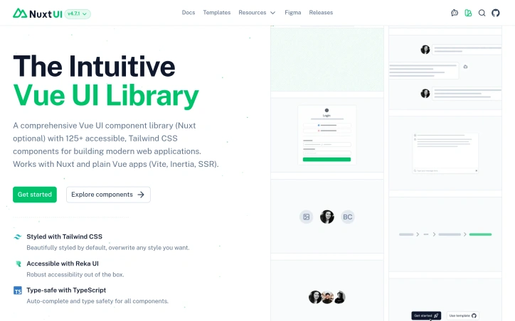
AI-generatedWhat stands out about Nuxt UI is its robust feature set, which includes over 125 customizable components, built with Tailwind CSS and Reka UI. This means that developers can tap into a vast library of pre-designed elements, saving them time and effort in the development process. The library's accessibility features, such as robust color contrast and semantic color system, ensure that web apps are usable by everyone.
One key feature worth noting is Nuxt UI's compatibility with both Vue and Nuxt applications, making it an attractive option for developers working on projects that require flexibility. Additionally, its auto-complete and type safety capabilities with TypeScript provide a seamless development experience.
Nuxt UI also boasts integration with popular frameworks like Vite, Inertia, and SSR, further expanding its reach and usability. Its light and dark mode features, coupled with the ability to change colors and icons at runtime through AppConfig, demonstrate a keen understanding of modern web development needs.
The library's reliance on Tailwind CSS ensures that designs are consistent and performance-optimized, while its integration with Reka UI provides robust accessibility out of the box. Furthermore, Nuxt UI's typography features, powered by @nuxt/content, deliver beautiful and consistent component styling.
While pricing information is not explicitly mentioned in the provided content, it's worth noting that Nuxt UI is an open-source library, suggesting a free or low-cost model for developers. This makes it an even more attractive option for startups and small businesses looking to build high-quality web apps without breaking the bank.
Key Features
Component Library
Over 125 customizable components built with Tailwind CSS and Reka UI.
Accessibility Features
Robust color contrast and semantic color system ensuring usability for everyone.
Multi-Framework Support
Compatible with both Vue and Nuxt applications for flexible development.
TypeScript Integration
Auto-complete and type safety capabilities for seamless development experience.
Dark Mode Support
Light and dark mode features with runtime color and icon customization via AppConfig.
Modern Framework Integration
Integration with Vite, Inertia, and SSR for expanded usability.
Use Cases
-
1
Web Developers
Building visually appealing and responsive web applications quickly without extensive custom styling.
-
2
Startups and Small Businesses
Creating high-quality web apps without breaking the bank using an open-source library.
-
3
Accessible Web Teams
Building inclusive web apps with built-in accessibility features and semantic color systems.
-
4
Full-Stack Developers
Working on projects requiring both Vue and Nuxt compatibility with TypeScript support.
FAQ
Is Nuxt UI free? ▾
How many components does Nuxt UI have? ▾
Does Nuxt UI support dark mode? ▾
Is Nuxt UI accessible? ▾
Pricing
Open-source library with no explicit pricing mentioned, free or low-cost for developers.
Tech Stack & Tags
Discussion
No comments yet — be the first!
Join the conversation — sign up to comment.
Sign up freeCommunity Support
Boost this project on Sell With boost
Meet the Founder
Anonymous Maker
More in AI Code Editors

RightNow AI Code Editor
RightNow AI is the first CUDA-native code editor...
Nexion - For Windows & Open Source
🎉 Big news! Windows version + Open-source relea...

Strix
Strix is an open-source AI hacking agent that fi...

shadcn CLI 3.0 and MCP Server
shadcn/ui is the foundation for your design syst...

Merge Agent Handler
Securely connect AI agents to enterprise-ready t...

Jam SQL Studio
We built Jam SQL Studio because Microsoft retire...