Xtra Hands Family Chore App
Household chore management remains one of parenting's persistent friction points, and Xtra Hands positions itself as the...

Catalyst Healthspan Audit
Personal trainers typically sell training sessions. This startup reversed the equation by building assessment first, mak...
Best Analytics Databases Startups & Tools
Databases optimized for fast analytics queries and dashboards.
Recently Listed
2 launches
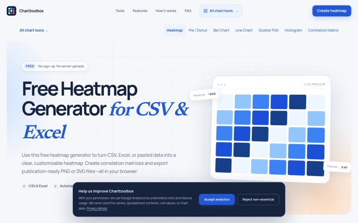
Spreadsheet visualizations typically fall into a frustrating middle ground: too simple for dedicated business intelligence platforms, yet tedious enough that they demand a dedicated tool. This browser-based heatmap and charting application addresses that exact gap, offering analysts, researchers, and data-curious professionals a fast route from raw data to polished visuals without the friction of traditional charting software. The core value proposition centers on speed and simplicity. Users paste or upload spreadsheet data—supporting CSV, Excel, and TSV formats—and the application automatically detects the structure and suggests suitable visualization types. The interface presents seven chart options: heatmaps, bar charts, line graphs, pie and donut charts, scatter plots, histograms, and correlation matrices. Once imported, data remains in the browser and never touches a server, addressing privacy concerns that deter some users from cloud-based tools. What distinguishes this offering from generic charting libraries is its intentional focus. Rather than overwhelming users with hundreds of parameters, the tool provides a curated set of controls designed for specific use cases. The heatmap functionality, positioned as the primary feature, includes automatic Pearson correlation calculation for researchers and color scales tuned for both clarity and color-blindness accessibility. Professional designers will appreciate the SVG export option alongside standard PNG output, allowing further editing in design tools when necessary. The application targets three distinct workflows. Business users can quickly generate comparison charts for reports and presentations. Academics can calculate correlation matrices for research papers without touching statistical software. Data analysts can explore patterns and outliers through interactive pivoting and scaling, all without writing code. The live preview mechanism means changes appear instantly, eliminating the compile-and-wait cycle common in traditional charting tools. Technical implementation reflects sound design principles. Smart defaults suggest sensible visualizations and color schemes immediately, reducing decision fatigue for casual users. The color palette options span sequential, diverging, and accessible formats with adjustable midpoints and limits. The upload capacity handles files up to 10 MB with 20,000 cells, sufficient for most analytic tasks that fall outside enterprise BI territory. The product is entirely free and requires no account creation, positioning it as a no-risk option for users evaluating their workflow. The combination of local processing, professional output, and streamlined design makes this genuinely useful for the everyday charting tasks that consistently fall through the cracks of more elaborate platforms.

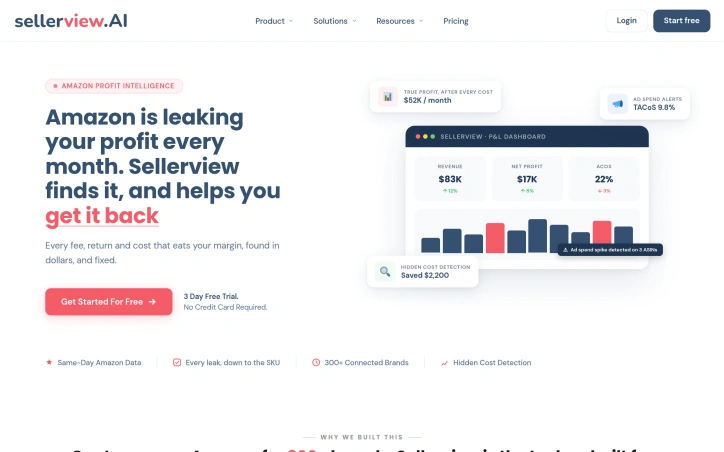
Amazon sellers operating multiple SKUs across various marketplaces face a constant challenge: understanding true profitability when fees, refunds, currency conversions, and ad spend scatter across different systems and reporting surfaces. Sellerview addresses this by consolidating SKU-level profit analytics into a single dashboard, designed for sellers and agencies managing multiple brands on Amazon. The platform's core strength lies in its granular approach to profit tracking. Rather than showing revenue or gross margin, Sellerview reconciles Amazon's complex fee structure—FBA costs, storage charges, shipping fees, refunds—alongside advertising spend and cost of goods to surface actual net profit per SKU. This distinction matters; a seller might see strong top-line revenue while margin gets quietly eroded by storage fee increases or undisclosed cost shifts. Real-time alerts represent another differentiator. Sellers receive same-day notifications when meaningful events occur: buy box losses, listing suppression, competitor behavior, or pricing changes. The dashboard breaks down alert frequency by type, giving sellers visibility into what's actually disrupting their business. This early-warning capability prevents the common scenario where profit leaks go undetected for weeks until monthly reporting surfaces the damage. The product's multi-marketplace architecture is noteworthy. With support for over 20 Amazon marketplaces globally, Sellerview consolidates accounting across geographies and currencies—unifying North America, Europe, and Far East regions into a single profit view. For agencies or sellers with operations spanning multiple markets, this eliminates manual currency conversion and per-region switching. The mobile application extends core functionality to iOS and Android, letting sellers monitor performance and catch alerts while away from their desk. Feature parity with the web version means mobile isn't a secondary interface but a genuine companion tool. One practical detail worth noting: team collaboration features allow sellers to share alerts via email or WhatsApp, addressing the workflow reality of distributed teams. The platform also surfaces competitor pricing and listing changes, though the company doesn't elaborate on how granular this monitoring becomes across different subscription tiers. The founding narrative—that the creators built Sellerview internally to manage Amazon operations across hundreds of brands before commercializing—suggests they solved their own immediate problem first. No explicit pricing details appear in the available material, making the business model's structure unclear from this presentation alone.