uploadthefile.com
Sharing files and publishing static content has long required friction: account creation, platform navigation, or comman...

CrabTap
Small businesses have long struggled to implement loyalty programs without massive overhead. CrabTap addresses this gap...

Catalyst Healthspan Audit
Personal trainers typically sell training sessions. This startup reversed the equation by building assessment first, mak...
Best Data visualization tools Startups & Tools
Turn raw data into charts, maps, and dashboards.
Recently Listed
3 launches
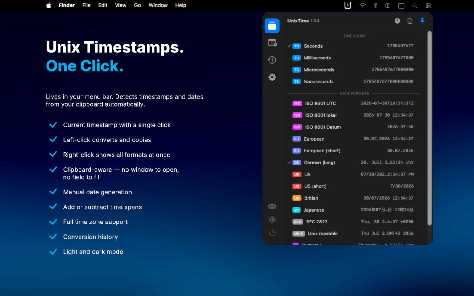
Developers working with Unix timestamps face a recurring friction: converting between epoch time and human-readable dates typically requires opening a browser, finding a converter, and pasting back and forth. UnixTime, a native macOS menu bar app, eliminates this workflow entirely by placing timestamp conversion directly where developers already spend their attention—in the menu bar. The core interaction is immediate. Hover over the menu bar icon to see what's on your clipboard, its conversion counterpart, and what a single click will copy, all before committing to the action. Click left to perform a conversion or copy the current timestamp if the clipboard is empty. Right-click to see all available output formats at once, customizable through drag-and-drop to show only what matters. The app operates completely offline, never transmitting data outside the local machine. What distinguishes UnixTime is its comprehensive format support. Beyond the standard Unix seconds and milliseconds, it handles microseconds, nanoseconds, and platform-specific formats used by .NET, Windows, Chrome, WebKit, Mozilla, Apple, and legacy Macintosh systems. It even converts astronomical Julian Day Numbers. Timestamps appear with their units labeled, eliminating ambiguity about scale. A built-in date and time calculator moves beyond simple conversions. Users can construct specific moments by entering dates, adjusting values by seconds through years, switching time zones, or generating random dates for testing purposes. Every conversion gets logged in a searchable history tied to the source application, so previously converted values can be retrieved and recopied without re-entering data. Customization is thorough. Users control which formats appear and in what order, set preferred defaults for timestamp and date output, and create unlimited custom date formats with unique names and patterns. The app respects macOS appearance settings, automatically following light and dark modes or locked to either. Localization spans 12 languages, and the business model is straightforward: a 2.99 euro one-time purchase with no subscription, advertisements, or data collection. The result is an app built directly for how developers actually work—minimizing context switching and reducing unnecessary steps in a task they perform hundreds of times.

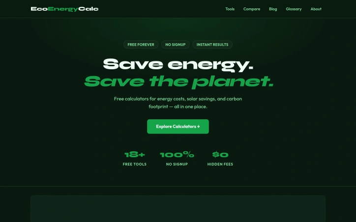
Helping homeowners quantify energy spending and environmental impact, EcoEnergyCalc offers a free suite of calculators designed to eliminate friction between users and sustainability decisions. The product targets homeowners and environmentally conscious individuals seeking concrete data on consumption patterns without signup walls or surprise fees. The breadth of the calculator library stands out immediately. Rather than a single-purpose tool, the platform bundles eighteen calculators spanning home energy costs, appliance consumption, solar returns, carbon accounting, and lifestyle impact. Users can model electric bill drivers, estimate LED bulb savings, calculate solar panel payback periods, or assess flight emissions from a unified interface. This variety appeals to people at different decision points, from those seeking quick cost-cutting wins to those evaluating capital investments like solar installation or electric vehicle purchases. The execution emphasizes frictionlessness. There is no account creation, no email verification, and critically, no hidden fees. Results appear instantly after entering location and usage data, which directly addresses a widespread frustration where competing energy tools bury actual calculations behind signup screens or gate analysis behind paywalls. The transparent free model removes the suspicion many users bring to digital tools in this category. The calculator scope reflects genuine homeowner priorities. Beyond standard energy cost tools, the platform includes fuel type comparisons, water usage tracking, rainwater harvesting analysis, and battery storage sizing. Carbon footprint calculators extend beyond home energy to cover diet, transport, and tree-planting offsets. This breadth signals the product recognizes that sustainability decisions span multiple domains and require different calculation frameworks rather than a monolithic one-size-fits-all approach. The platform's free-forever positioning stands in stark contrast to competitors that monetize through premium tiers or conversion funnels built into the calculation process itself. Users get results without the usual gatekeeping. What remains unclear is the depth of underlying data and methodology. Whether these calculators incorporate local utility rates, track equipment efficiency curves, or update carbon accounting as electrical grids decarbonize cannot be assessed from the interface description alone. A calculator's real utility depends entirely on data quality and update frequency. The gap between smooth user experience and analytical rigor will ultimately determine whether this becomes a genuinely trusted decision-support tool or merely a polished curiosity.
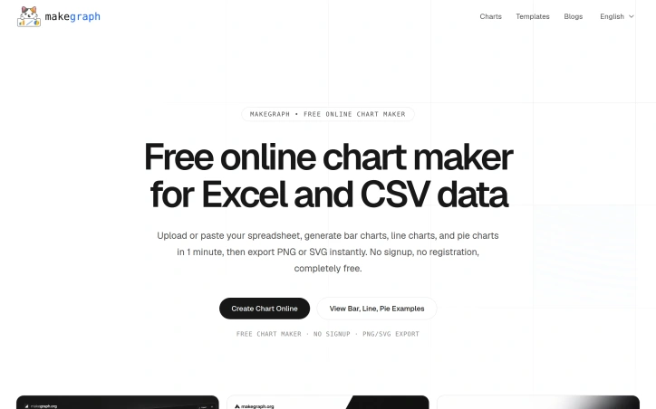
Data visualization is a crucial step in understanding and presenting complex information, but creating clear and compelling charts can be a tedious task, especially for those without extensive design or technical expertise. MakeGraph addresses this issue by providing a straightforward online chart maker that allows users to quickly transform their data into visually appealing charts. The tool is designed for individuals who need to generate charts for reports, presentations, and dashboards, and is particularly useful for those working with Excel or CSV data. What stands out about MakeGraph is its simplicity and versatility. The platform offers a range of chart types, including line charts, scatter charts, radar charts, and various bar chart configurations, such as stacked and waterfall charts. Users can upload their data or paste it directly into the tool, customize labels and colors, and preview their charts instantly. The ability to export charts as PNG or SVG files adds to the tool's convenience, making it easy to integrate the visualizations into various applications. The key features of MakeGraph include its ease of use, instant preview capabilities, and support for multiple chart types. The fact that it is completely free, with no signup or registration required, makes it an attractive option for users who need to create charts on the fly. The tool's flexibility in handling different data formats and its customization options further enhance its utility. Overall, MakeGraph is a valuable resource for anyone looking to simplify their data visualization process and create high-quality charts without fuss.