GeniusAI
Creative professionals and businesses struggling to generate high-quality visual content at scale now have access to a s...

Vehla
Streamlining workflows on Mac devices is a daunting task, especially when users have to juggle multiple utilities to acc...

Website Auditor
As artificial intelligence increasingly becomes the primary search method for consumers, most businesses remain invisibl...
Recently Listed
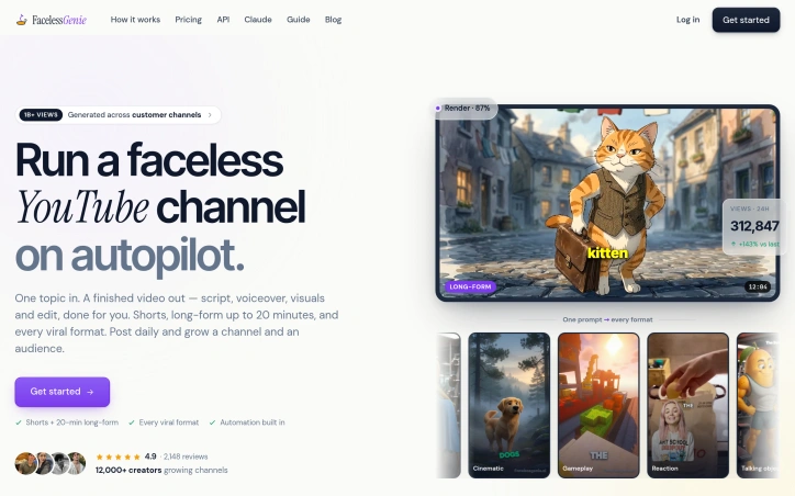
623 launchesAutomated video generation is reshaping how independent creators scale their output. FacelessGenie addresses a real constraint in that workflow: the gap between having a content idea and possessing the technical skills, equipment, and hours required to produce it professionally. The platform takes a creator's topic or brief and handles the entire pipeline—scriptwriting, voiceover generation, visual composition, music selection, and final editing—delivering a finished video ready to upload. The product targets creators operating across YouTube, Instagram, and TikTok. Rather than focusing on a single format, FacelessGenie covers multiple content archetypes: character-driven narratives, talking objects, explainer videos, reaction content, gameplay captures, and AI-generated visuals. It supports both short-form content and long-form pieces up to twenty minutes, allowing creators to experiment across platform-native formats rather than repurposing a single video. What distinguishes FacelessGenie in a crowded field is its breadth of pre-built templates and its claimed consistency in output quality. The site showcases example channels in specific niches—stoicism, history, science, finance, pet care, and self-improvement—each designed to demonstrate that the AI-generated videos can approximate the visual and narrative style of established, successful channels. This signals both capability and deliberate positioning toward profitable niches rather than arbitrary content. The platform has accumulated measurable traction. Its user base includes over twelve thousand creators, with four hundred of them reaching audiences beyond one hundred thousand subscribers. Videos produced through FacelessGenie claim to have generated more than one billion cumulative views. The product carries a 4.9-star rating across over two thousand reviews, suggesting consistent user satisfaction. One gap in the available information is transparency around pricing and business model. The site mentions getting started but does not disclose whether FacelessGenie operates on a subscription model, usage-based pricing, or another structure—a material detail for creators evaluating whether the tool fits their economics. The core value proposition is clear: compress the production cycle from hours or days to a single afternoon. For creators managing multiple niches or chasing trending formats, that compression has direct business impact. Whether the efficiency gains justify adoption depends on whether creators prioritize the tool's automation over hands-on creative control.

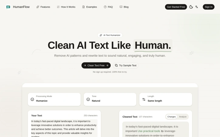
In an era where AI-generated content permeates digital communication, the gap between machine-written text and human writing has become a practical problem for many. HumanFlow targets this friction point with a straightforward solution: an AI-powered text cleaner that rewrites generated content to eliminate robotic patterns and sound more naturally human. The product addresses a specific audience spanning content creators, students, professionals, and copywriters who rely on AI drafting tools but need their output to read authentically. According to the platform's demonstration, the transformation is significant—a sample text scoring 92% as AI-generated drops to 8% after processing, accompanied by meaningful rewrite changes that maintain core meaning while improving readability and flow. The platform's strength lies in its simplicity and accessibility. The three-step workflow (paste text, let AI rewrite, copy results) requires no sign-up or payment, removing friction from adoption. The absence of account creation barriers positions it as an impulse-use tool for one-off cleaning tasks. The company emphasizes that processing occurs securely without data retention, addressing privacy concerns that might otherwise inhibit users from pasting sensitive content. User testimonials highlight practical value: a content creator reports natural-sounding results that evade detection systems, a student appreciates preserved meaning with humanized output, and a copywriter emphasizes time savings. These voices represent the core user base the product aims to serve. Notable gaps exist in the promotional materials. While the platform claims to support multiple AI model outputs and offers an API for developers, specifics remain absent from the public-facing content. The FAQ structure suggests these questions are commonly asked, yet the answers are not provided in the available materials. Pricing information focuses entirely on the free tier; any monetization strategy for advanced features or higher-volume usage remains unstated. HumanFlow occupies a defensible niche within a growing category of tools aimed at AI content post-processing. The free barrier to entry and streamlined interface make it accessible to its target audience. Whether the AI Score metric accurately predicts real-world detection evasion, or whether the rewriting approach truly preserves semantic intent across diverse content types, would require independent testing to verify. For writers seeking a low-friction way to add human polish to machine-generated drafts, the product delivers on its core proposition.

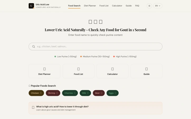
People managing gout often struggle to find practical, accessible guidance on which foods to avoid or embrace. Uric Acid Low addresses this gap by providing a free tool designed specifically for anyone looking to control their condition through dietary changes without the friction of registration. The product centers on a searchable database of over 150 foods categorized by purine content, the compound linked to elevated uric acid levels. Users can instantly check any food's classification as low, medium, or high purine, bypassing the confusion and outdated advice that typically surrounds gout management. The tool removes friction entirely: no signup required, no paywalls between users and the information they need. Beyond the core search function, the platform includes a diet planner for meal construction, a calculator for tracking purine intake, and an educational guide explaining uric acid and gout causes. A dedicated FAQ section with over 50 common questions provides quick answers to concerns that gout sufferers frequently encounter. The founder's motivation stems from real user outcomes—one user reduced their uric acid from 8.2 to 5.9 through dietary intervention, demonstrating that targeted food management can deliver measurable results. The product's accessibility sets it apart in a landscape often dominated by paywalled wellness apps or clinical referrals. By eliminating signup friction and keeping the core tool free, the platform democratizes gout management for someone diagnosed at a doctor's office who needs immediate, actionable guidance. The design philosophy prioritizes speed: searching a food takes seconds, not minutes. Commercially, Uric Acid Low operates as a free tool with affiliate income from recommended supplements like tart cherry concentrate through Amazon Associates. This model avoids direct monetization of users while still generating revenue from ancillary products, a common approach for utility-focused health tools. The main constraint lies in scope: a searchable food database and planning tools can guide dietary choices, but they cannot replace medical supervision or address all gout triggers, which can include genetics and certain medications. Still, for the segment of gout sufferers seeking diet-driven management, the tool delivers a straightforward, friction-free entry point that removes barriers to action.

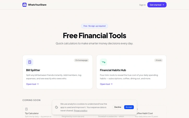
Friend groups frequently encounter tension when splitting expenses—whether coordinating a group dinner, weekend trip, or ongoing shared activities. WhatsYourShare addresses this friction point by centralizing expense tracking and settlement within a single interface tailored for social groups rather than formal business entities. The product targets friend groups that regularly engage in shared activities and need to maintain clear accounting without introducing awkward money conversations. Unlike general-purpose expense-splitting apps or accounting software, WhatsYourShare positions itself specifically around the use case of sustained social groups managing multiple outings and adventures together. The founder's emphasis on maintaining friendship integrity while handling finances suggests the core value proposition centers on reducing the administrative burden that can create distance among friends. The available information positions this as free-to-access financial tooling, meaning the barrier to entry is nonexistent. This aligns with the audience—friend groups typically resist adoption friction and would be unlikely to pay for splitting casual expenses. The specific framing around one group coordinating multiple adventures indicates the platform likely emphasizes repeated use across multiple transactions rather than one-time splits, suggesting features for persistent group profiles and activity history. What distinguishes WhatsYourShare from the crowded space of expense-splitting solutions is its deliberate social framing. Rather than treating expense management as a cold accounting problem, the positioning centers friendship preservation as the primary goal, with financial accuracy as the enabler. This reflects genuine distinction in product philosophy: the tool exists not primarily to eliminate debt or maximize financial precision, but to remove the interpersonal friction that arises when money enters friend dynamics. The free pricing model and group-first architecture suggest WhatsYourShare targets organic, word-of-mouth adoption within social networks. User acquisition likely comes from friend referrals within established groups rather than marketing to individuals. This distribution model aligns naturally with the product's social focus and could create compounding adoption benefits as entire friend groups migrate to shared coordination. Without additional detail on specific capabilities, settlement mechanisms, or feature breadth, the positioning alone indicates thoughtful product design oriented toward actual user behavior and motivations. The strategic choice to center friendship preservation alongside financial management reflects understanding that the real problem isn't calculation—it's trust and coordination at the social layer.

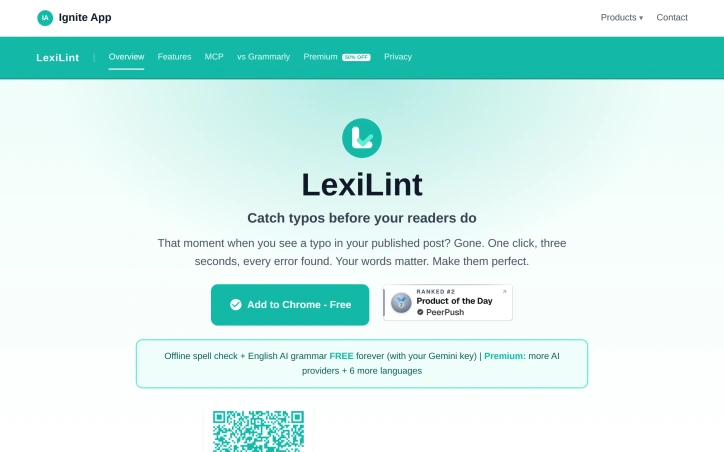
Grammar checkers have traditionally demanded accounts, monthly fees, and access to every keystroke. LexiLint inverts this model entirely. The tool carries out spelling and grammar corrections in the browser without storing text on any server, eliminating the privacy tradeoff users have long tolerated from competing services. The product targets writers and content creators who publish online and want to catch errors before readers do. It also appeals to AI users who recognize that grammar checking consumes unnecessary tokens when offloaded to a separate, local tool. The privacy-conscious find value in its core architecture, which processes text locally and never logs activity. What distinguishes LexiLint is its reliance on bring-your-own-key economics. Spell checking runs entirely offline using local dictionaries plus optional custom entries for technical terms or brand names. Grammar checking requires an AI provider, but users supply their own API credentials to services like Google Gemini, OpenAI, or Claude, keeping all text under their control. This approach sidesteps the data monetization model that fuels free grammar tools elsewhere. The feature set covers practical needs. Offline spell checking works on any webpage using curated English dictionaries. An AI grammar mode handles style, clarity, and punctuation deterministically, so the same page yields the same corrections each time. The tool supports eight languages including Spanish, French, German, Polish, Russian, and Turkish, with spell checking across all and grammar checking available in each. Users interact through a Chrome extension or tap it within AI assistants via the Model Context Protocol, enabling grammar checks inside Claude Desktop, ChatGPT, and Cursor without consuming AI tokens. The pricing structure is transparent. Spell checking costs nothing. Grammar checking through AI providers is free for users who hold Gemini API keys and charged at standard rates for OpenAI or Claude. No hidden subscriptions or per-check fees exist, and setup requires no account creation. LexiLint fills a niche for users who want reliability and privacy from their grammar tools. It trades the convenience of a single account for control of API keys themselves—a reasonable swap for those skeptical of platforms that monetize user text. The offline spell checking alone justifies installation for anyone tired of revealing their drafts to third parties.
Choosing the right professor shapes the entire college experience, yet students typically make this decision with incomplete information. Rate My Professor addresses this knowledge gap by aggregating candid assessments from actual students to help learners identify instructors whose teaching styles and classroom dynamics align with their needs. The platform targets undergraduate and graduate students navigating course selection. By collecting anonymous peer reviews without requiring an account, it lowers barriers to both contributing and accessing honest feedback. Students understand institutional incentives to remain quiet, so anonymity becomes the prerequisite for truth-telling. Their evaluations accumulate toward shaping others' decisions. What distinguishes Rate My Professor is its multi-faceted rating system. Rather than collapsing professor quality into a single score, the platform captures nuanced dimensions: teaching quality, course difficulty, personality, treatment of students, subject mastery, and research guidance capacity. This granularity acknowledges that great teaching takes different forms and matters differently across disciplines and learning preferences. A student seeking rigorous methodology critiques values a professor differently than one prioritizing accessible mentorship. The submission process emphasizes verification without friction. Respondents complete a simple verification check to prove familiarity with the professor, blocking spam while preserving anonymity. The form guides constructive feedback and explicitly discourages personal information sharing, encouraging substantive critique over character attacks. Rate My Professor operates across multiple countries and represents thousands of universities worldwide. The platform reports fifty thousand professors rated globally, over five hundred thousand reviews collected, and influence on more than one million course decisions. This breadth suggests network effects: the more students contribute, the more valuable the resource becomes for future enrollees. The product's restraint is notable. It sticks to its core function—professor reviews—without feature creep toward social networking, grade distribution, or tangential additions. This focus strengthens its utility as a decision-making tool rather than a time sink. The absence of a paywall or account requirement removes friction during registration periods when students most need this information. Rate My Professor fills a genuine void in course planning by systematizing peer knowledge and making it accessible, shifting professor selection from guesswork to informed choice.

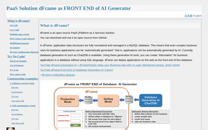
Open-source platforms that eliminate the need for custom programming have gained traction in recent years, but most still require at least some technical knowledge. dFrame tackles a specific problem: automating the creation of business applications directly from normalized database schemas, without requiring developers to write frontend code. The platform targets organizations that want to deploy operational applications quickly, particularly those working alongside AI database generation tools like Chat2DB. Rather than starting from scratch, users can leverage AI to generate database structures, then have dFrame automatically produce the web interface layer. This workflow removes two major friction points: SQL expertise and frontend development. What distinguishes dFrame from generic no-code platforms is its architectural approach. Applications generated through dFrame run against fully normalized MySQL databases, with each application stored in its own database schema. This encapsulation creates clear boundaries between applications, improving maintainability and making it feasible to host multiple applications on a single instance. For teams that need custom logic beyond basic data operations, the platform offers a low-code path through MySQL procedures, views, functions, and triggers, avoiding the need to rewrite entire application layers. The feature set covers typical business application needs: data entry, searching, editing, and list views with pagination. Export capabilities include PDF and CSV formats. The workflow follows a natural progression—users define objects and fields in a settings mode, then switch to an application mode for actual data operations. Existing database schemas can be imported directly, eliminating setup friction for teams migrating from legacy systems. The platform is available as open source through GitHub, removing licensing barriers to adoption. No explicit pricing model appears in available materials, suggesting this is positioned as a community-driven project rather than a commercial offering. The documentation positions dFrame primarily around AI integration and no-code workflows, though the practical limitations of purely no-code systems deserve consideration. The platform works best for applications with standard CRUD operations and normalized data structures. More specialized requirements would require stepping into the low-code layer, which increases complexity accordingly. dFrame positions itself as infrastructure for a specific workflow: leveraging AI to generate database structures, then exposing them through automatically generated web interfaces. Organizations with this exact need have a working solution. Those building more complex applications or requiring deep customization would need to evaluate whether the low-code extensions or hand-coding alternatives better serve their timeline and capability constraints.

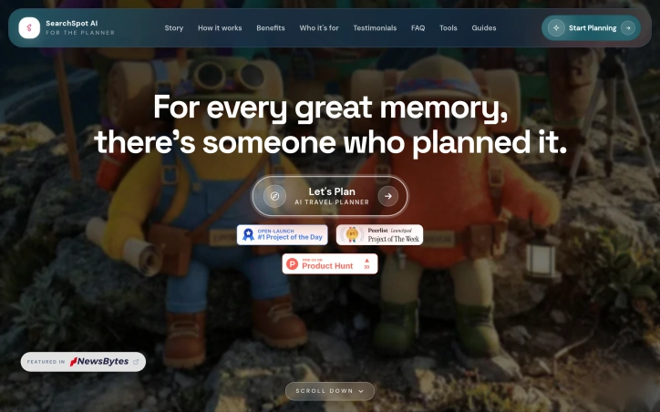
Group travel planning traditionally falls on one person: the organizer who opens browser tab after tab comparing flights, hotels, restaurants, and attractions across countless platforms, never confident they've found the best option or overlooked a gem. SearchSpot targets this pain point by consolidating the research phase into a single workspace that pulls data from over twenty different OTAs, travel platforms, social media, and content sites. The product's core value proposition centers on elimination of context switching. Rather than toggling between booking sites, review aggregators, and safety databases, users describe what they want—budget constraints, trip vibe, must-haves—and SearchSpot surfaces curated recommendations with explicit reasoning for why each option was selected or rejected. The platform crawls multiple sources for pricing and card offers, filters reviews by real travelers using signals from Google Maps, Reddit, and social platforms, and includes exhaustive research on legal requirements, weather, and safety information. What distinguishes SearchSpot is its commitment to the full trip lifecycle. Beyond comparing individual components, it links flights, accommodations, activities, and restaurants into an interconnected itinerary. When a user adjusts a single detail, the entire plan recalculates to maintain budget alignment and timeline consistency. This approach recognizes that travel planning isn't actually about finding one perfect hotel—it's about orchestrating thousands of small decisions that compound. The filtering visualization is particularly instructive. Instead of dumping a thousand options at the user, SearchSpot shows the funnel of its reasoning: 250 hotels found, 50 match your vibe, 12 fit your budget, 4 finalists. This transforms research from a cognitive burden into a transparent narrowing process where users can see what was eliminated and why. The company commits to remaining free indefinitely, lowering the barrier to adoption compared to subscription-based travel planning tools. Integration with calendar and map applications suggests an opinionated view about how planning works in practice—not just in isolation, but synchronized across a user's existing digital life. SearchSpot aims at a specific problem: the exhaustion of being the trip organizer. It targets not necessarily the most frequent traveler, but the person in every group who gets voluntold to plan.

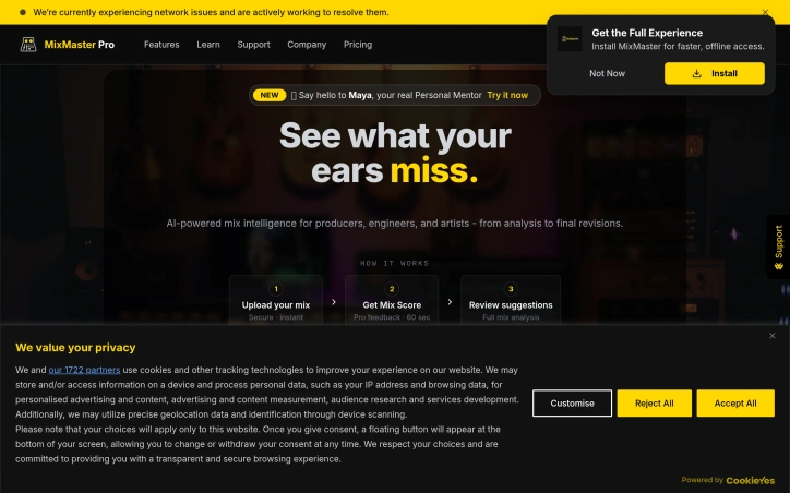
Fragmented audio production workflows have long forced music producers to bounce between specialized tools for mixing analysis and feedback, creating an environment where context gets lost between sessions. MixMaster Pro consolidates this experience by centralizing mix analysis within a single platform that maintains the full history of revisions, analyses, and reference materials. The core value proposition eliminates the friction of exporting mixes, uploading them to separate services, and manually reconciling feedback across systems. By keeping all analytical data in one place, the platform allows producers to focus on the creative work of mixing rather than tool administration. The platform includes Maya Studio coaching, a feature designed to understand a producer's specific mix evolution and provide contextual guidance. Rather than delivering generic analysis, this coaching mechanism tracks how a mix changes over time and delivers insights tailored to that progression. This approach recognizes that mixing is iterative—what matters isn't just the current state of a mix, but how it's evolving and what pattern of decisions led to it. The target audience is music producers who have reached a level of sophistication where they're actively seeking tools to improve their mixes. Producers working with multiple projects or those who struggle to identify mix issues by ear alone represent the natural customer base. The platform's success will be determined by whether the AI analysis meets professional audio standards and whether the coaching feature identifies mix problems that experienced producers typically overlook. Producers frustrated with tool fragmentation will find the unified approach compelling. Given the sparse website content and lack of detailed technical specifications, professional validation of the AI's analytical quality should precede any commitment for critical production work.

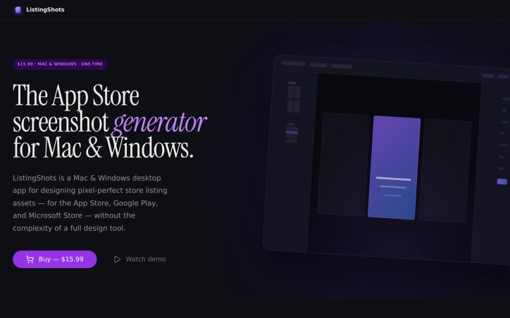
App developers shipping to multiple platforms face a repetitive design bottleneck: creating pixel-perfect screenshots tailored to the unique specifications of the App Store, Google Play, Microsoft Store, and dozens of other digital storefronts. ListingShots addresses this friction with a desktop application purpose-built for asset design without the overhead of general-purpose design tools. The product targets indie developers, small studios, and founders managing listings across the 47 supported platforms—ranging from major app stores to YouTube, Steam, social channels, and web stores. Rather than imposing the full complexity of professional design software, ListingShots constrains itself deliberately. It ships with presets for each platform's exact dimensions, 26 starting templates (Feature Highlight, Dark Pro, Bold Violet, Photo Story among them), and 20+ gradient swatches to accelerate the design phase beyond a blank canvas. The editor handles the essential operations: layering images, shapes, text, and device frames with both 2D and 3D transformations. A built-in search connects to Openverse's CC-licensed photo library, allowing developers to source backgrounds without leaving the app. The export path is direct: one click generates pixel-perfect PNGs at native resolution, ready for upload to any storefront. What distinguishes ListingShots most visibly is its business model and architectural philosophy. At $15.99 as a one-time purchase—not a subscription—the tool positions itself against recurring-fee screenshot generators. The application operates entirely offline, local-first, with no account, cloud storage, or dependency on external services. For teams managing unreleased builds, this offline-first approach eliminates cloud transmission and provides a straightforward cost comparison over five years of operation. ListingShots succeeds not through feature breadth but through disciplined scope. Rather than attempting to rival full design suites, it solves a singular, repetitive problem for a defined audience. For indie developers and small studios managing store listings across multiple platforms, this focused design eliminates paralysis and delivers finished, store-ready assets in minutes rather than hours. The preset-first approach and local-only operation reduce decision friction at every step—making it a credible alternative to both expensive design tools and subscription-based competitors.

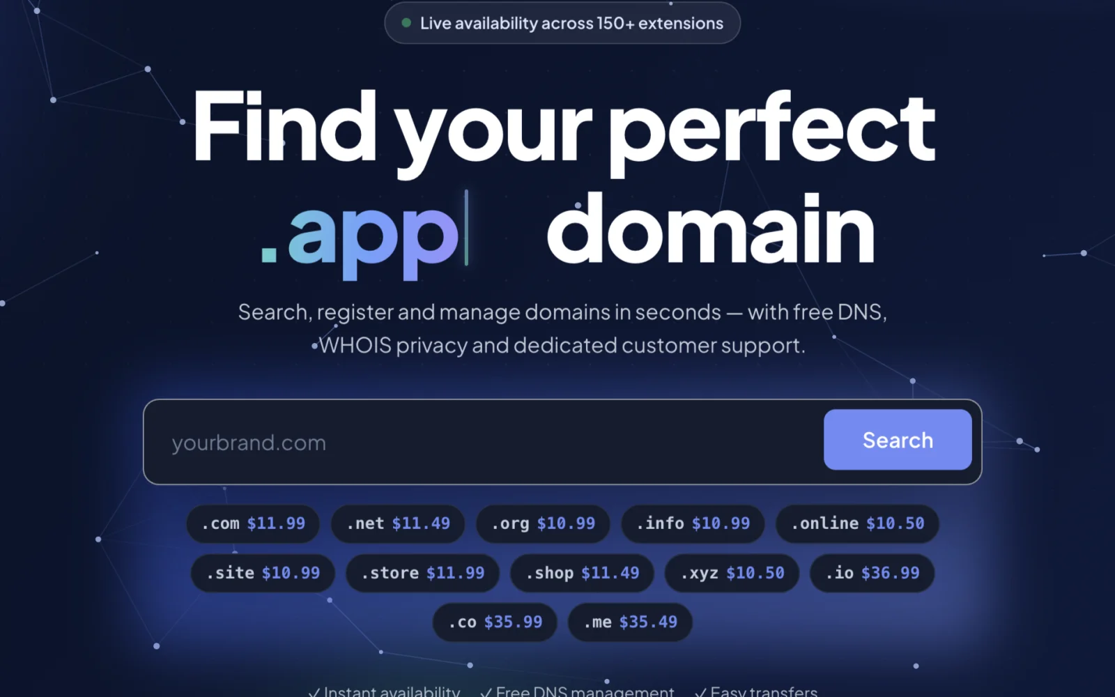
Establishing an online presence begins with securing a domain name. For individuals, startups, and businesses, managing domain registrations, transfers, and renewals can be a tedious and overwhelming task. DomRegus simplifies this process by offering a comprehensive platform for domain management. The platform is designed to be intuitive and secure, providing users with a streamlined experience for registering and managing domains across over 150 extensions. Transparency is a key aspect of DomRegus, evident in its clear pricing structure. The cost of registering various domain extensions is explicitly stated, with prices ranging from $2.99 for a .xyz domain to $46.99 for a .ai domain. One of the standout features of DomRegus is its commitment to providing essential services alongside domain registration. Users are offered free DNS management and WHOIS privacy, empowering them to maintain full control over their domain portfolio. The platform also facilitates easy domain transfers and renewals, ensuring that users can manage their online identity efficiently. By combining trusted domain infrastructure with modern technology, DomRegus delivers a reliable and efficient registration experience. As an authorized OpenSRS reseller, the platform leverages established expertise to provide a secure environment for domain management. Overall, DomRegus is a robust solution for those seeking to secure and manage their online presence, offering a compelling blend of simplicity, transparency, and powerful management tools.
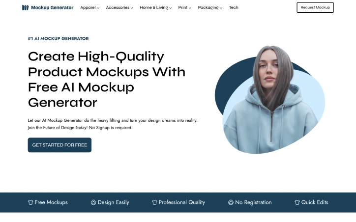
Designing high-quality product mockups is a crucial step in bringing designs to life, but it can be a time-consuming and costly process. Mockup Generator AI addresses this challenge by leveraging AI automation to simplify and accelerate mockup generation. The platform is designed for individuals and businesses looking to create professional-grade mockups without the need for expensive software or extensive design expertise. It caters to a wide range of use cases, including e-commerce, advertising, and presentation design. What stands out about Mockup Generator AI is its ability to produce high-resolution mockups in seconds, with a vast library of over 2000 templates across 25 categories. Users can upload their designs, edit the mockup template, and download the final product in their preferred format. The AI-driven process eliminates the need for manual design work, allowing users to focus on their core creative tasks. Key features of the platform include its ease of use, fast generation capabilities, and flexibility in terms of output formats and resolutions. The fact that it is free to use, with no registration required, makes it an attractive option for individuals and small businesses. Additionally, the absence of watermarks on the generated mockups ensures that users can utilize the output for commercial purposes without any restrictions. The platform's versatility is evident in its diverse range of mockup templates, covering various product categories such as apparel, packaging, and advertising materials. Overall, Mockup Generator AI offers a powerful solution for designers, marketers, and entrepreneurs looking to create high-quality mockups quickly and efficiently.
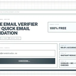
Validating email addresses is a crucial step in maintaining a healthy mailing list and ensuring that messages reach their intended recipients. The Email Verifier tool addresses this need by providing a simple, instant, and accurate way to check whether an email address is valid. This tool is particularly useful for marketers, developers, and sales teams who need to verify email addresses as part of their daily workflow. What stands out about this product is its ease of use and high accuracy rate. The tool is designed to be used directly in the browser, with no installation or account required, making it a convenient solution for quick email checks. The advanced verification engine guarantees an accuracy rate of 99.6%, which is achieved through comprehensive checks including syntax validation, domain verification, MX record lookup, and deliverability assessment. The tool's capabilities are geared towards providing a robust email validation experience. It checks the format of the email address to ensure it conforms to RFC standards, verifies the existence and validity of the domain, and looks for technical signals that indicate whether the address can receive messages. The fact that it processes data securely, without storing or sharing email addresses, is also a notable aspect. Notably, the Email Verifier is free to use, with no signup required, making it an accessible solution for individuals and teams. By using this tool, users can reduce bounce rates, protect their websites from spam registrations, and maintain a healthy mailing list. Overall, the Email Verifier is a reliable and efficient solution for anyone looking to validate email addresses quickly and accurately.
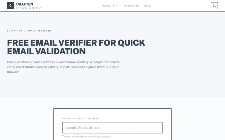

Ecommerce sellers, marketers, and SaaS founders constantly grapple with complex fee structures and calculations across multiple platforms. Ecom Calc Tools directly addresses this pain point by offering a suite of free online calculators that simplify the process of estimating real profits after accounting for various marketplace fees, ad spend, shipping, returns, and payment costs. The platform is designed for users who need to compare costs across different ecommerce platforms like Amazon, Etsy, Shopify, eBay, and TikTok Shop, as well as payment providers such as Stripe and PayPal. What sets Ecom Calc Tools apart is its commitment to transparency and data verifiability. Every calculator documents its sources, assumptions, and update policy, allowing users to review the underlying numbers and methodology. The calculators are built using official fee sources and transparent formulas, and users can report corrections if they identify any discrepancies. This approach fosters trust and ensures that users can rely on the calculations for making informed business decisions. Notably, all calculations run directly in the user's browser, eliminating the need for signup, email registration, or data storage. This design choice prioritizes user privacy and convenience. The platform also provides in-depth guides on various ecommerce fees and margins, updated for 2026, which serve as a valuable resource for users seeking to understand platform costs. With a wide range of calculators available, including ecommerce, marketing, SaaS, finance, and payment tools, Ecom Calc Tools caters to a broad user base. The absence of a signup process or email wall makes it easily accessible for quick checks and side-by-side comparisons, making it a practical resource for day-to-day planning. The entire suite of tools is available for free, with no explicitly mentioned pricing or business model to restrict access.
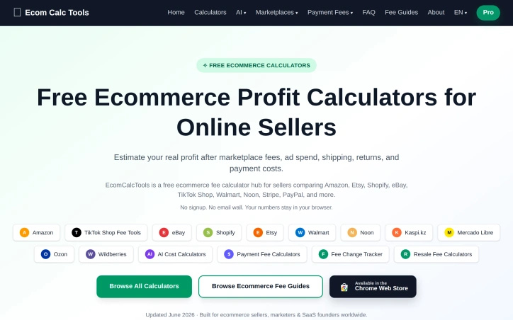

Recruiting decisions rest on incomplete information, yet most AI tools compound the problem by hiding their reasoning under a layer of polish. MindRecruiter addresses the core frustration: recruiters who want to understand why an AI system reached a particular conclusion before trusting it with a hiring decision. The product breaks this down into a two-stage thinking model. First, it surfaces raw reasoning across six structured dimensions: an initial hypothesis, underlying assumptions that might be flawed, an alternative evaluation angle, potential red flags, unexpected considerations, and a recommended next step. Only then does it synthesize these into a professional-grade conclusion suitable for documentation or stakeholder communication. The theory is sound—that gap between unfiltered reasoning and polished output contains the actual decision-making insight. The interface is designed for speed and flexibility. Users paste job descriptions, candidate profiles, or hiring scenarios directly into a web interface. A Chrome extension adds one-click analysis for LinkedIn profiles and job postings without scraping or storing data. File uploads support PDFs, Word documents, and images. The entry barrier is deliberately low: four free analyses available immediately without authentication. For extended use, the token system removes friction while maintaining privacy. Free tokens last 30 days and persist only on the user's device—no account creation, no email tracking, no data transmission. This is a genuine technical choice rather than marketing language. Every session remains local, and the company states it doesn't log or store anything, a rare commitment in an industry where data hoarding has become default practice. The ambitions here are measured rather than grandiose. MindRecruiter is explicitly positioned as a private beta experiment rather than a polished product, which signals genuine research into how AI transparency in hiring could work rather than a rush to market. It's part of a broader free suite under SKILLSINPUT.AI that includes resume generation, salary tools, and career roadmaps. What's genuinely missing are real constraints: evidence of how the reasoning holds up on complex hiring decisions, whether six dimensions exhaust all recruiting scenarios, or what the actual output quality looks like beyond template prompts. The transparency promise is the entire product—if that reasoning is shallow or misses domain-specific nuance, the tool fails immediately. For recruiters skeptical of black-box AI but willing to experiment with something genuinely transparent, this is worth testing. For those seeking a production-ready system, it's still too experimental.

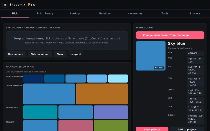
Color management is a complex task that designers face daily, particularly when working with multiple color systems such as Pantone, RAL, and NCS. Shademix addresses this challenge by providing a comprehensive, free online tool that simplifies color selection, conversion, and palette creation. The product is specifically designed for designers who need to ensure accurate color representation across different professional color libraries and require accessibility checking. What stands out about Shademix is its versatility and range of features. The tool allows users to pick colors from images, camera feeds, or screens, and supports a variety of file formats, including JPG, PNG, and WebP. The eyedropper feature offers sub-pixel precision, enabling designers to extract colors accurately. The dominant colors feature automatically generates a 25-color palette from an image, while the harmonies feature generates color schemes based on a chosen color. The product's capabilities extend beyond color picking and palette creation. It includes a range of analysis tools, such as a WCAG contrast checker, color blindness simulation, and CMYK gamut warning, which help designers ensure their color choices are accessible and suitable for different mediums. Additionally, Shademix allows users to export palettes in various formats, including CSS, SVG, and Adobe .ase, making it easy to integrate the tool into different design workflows. Notably, Shademix is available for free, with no explicit mention of a pricing model or tiered plans. The product is accessible on the web, mobile, Mac, and Vision Pro, making it a versatile solution for designers working across different platforms. Overall, Shademix is a valuable resource for designers seeking to streamline their color management processes and ensure color accuracy across different systems and mediums.

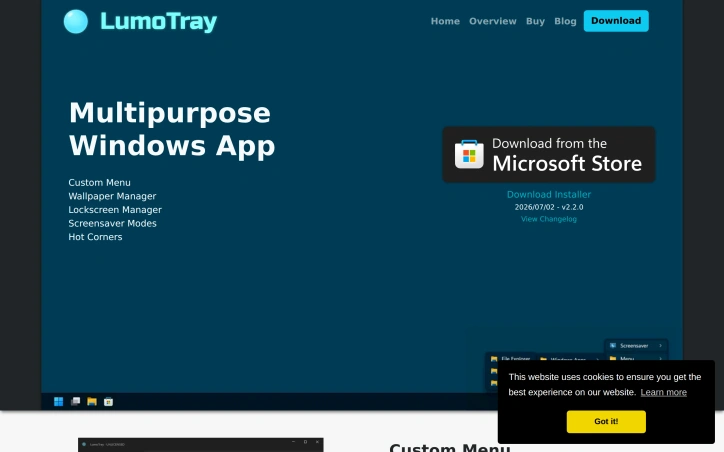
Windows users managing multiple monitor setups have long contended with clumsy workarounds for coordinating wallpapers, lockscreen backgrounds, and screensaver modes across displays. LumoTray directly addresses this friction by bundling wallpaper management, lockscreen customization, screensaver modes, and a custom menu builder into a single utility. The breadth of features for a solo developer project is substantial. The wallpaper manager supports live and animated wallpapers, video playlists, solid colors with gradients, and rotating feeds from Unsplash, Wallhaven, NASA, Windows Spotlight, and museum art collections. The lockscreen manager offers the same customization options, letting users maintain visual consistency across login screens. Screensaver and fullscreen modes add functional displays including clocks, alarms, timers, and Shadertoy visualizations. The custom menu builder adds productivity value beyond aesthetics. Users construct multi-level menu structures with virtually unlimited shortcuts to files, applications, scripts, and documents—all accessible from the tray icon. The hot corners feature, new in version 2, enables actions triggered by moving the cursor to screen edges, functionality Windows itself lacks. What distinguishes LumoTray is its handling of multi-monitor configurations that Windows doesn't natively support. The ability to set different wallpapers per monitor and manage non-standard setups addresses a genuine limitation in the operating system's capabilities. The business model keeps overhead minimal. The software is free to download with all features fully functional and no imposed limitations. A $19 one-time license is entirely optional, available for users who find substantial value or use the tool in business contexts. This avoids subscription mechanics while fairly compensating the developer's ongoing work. Consistent updates reinforce active development. The project releases new features every couple months; version 2 introduced live wallpapers and additional content sources, and version 2.2 added museum art and NASA EPIC collections. This pace suggests the developer genuinely engages with feature requests rather than treating the project as maintenance-only.

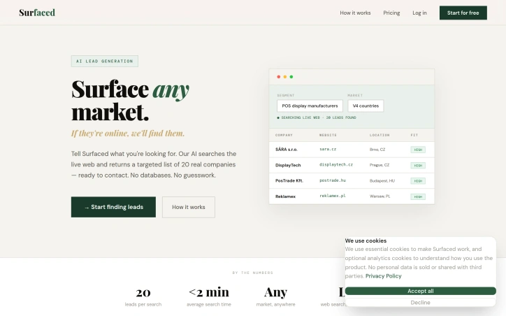
B2B lead generation is a challenging task, especially when relying on outdated databases that often yield stale or irrelevant results. Surfaced tackles this problem head-on by utilizing AI-powered live web searches to deliver targeted, up-to-date leads. This is particularly beneficial for businesses seeking to connect with newer, niche, or regional companies that may not be listed in traditional databases. What sets Surfaced apart is its ability to search the live web in real-time, rather than relying on static databases that can be months out of date. This approach ensures that the leads generated are current and relevant, giving users a significant advantage in their outreach efforts. The AI-driven search process is also refined through a series of clarifying questions, ensuring that the results closely match the user's specific needs. The platform's functionality is streamlined into a three-step process: describing the target market and industry segment, launching an AI-powered search, and receiving a structured list of leads. The resulting list includes essential company information, such as website, contact details, location, and a relevance score, which can be easily exported to a CRM or cold email sequence. Notably, Surfaced's business model includes a fair pricing structure, where unused credits are returned if a search yields no results, and a built-in mail bounce checker to ensure that only valid email addresses are suggested. Overall, Surfaced offers a robust solution for businesses seeking to identify and connect with their target audience in a more efficient and effective manner.

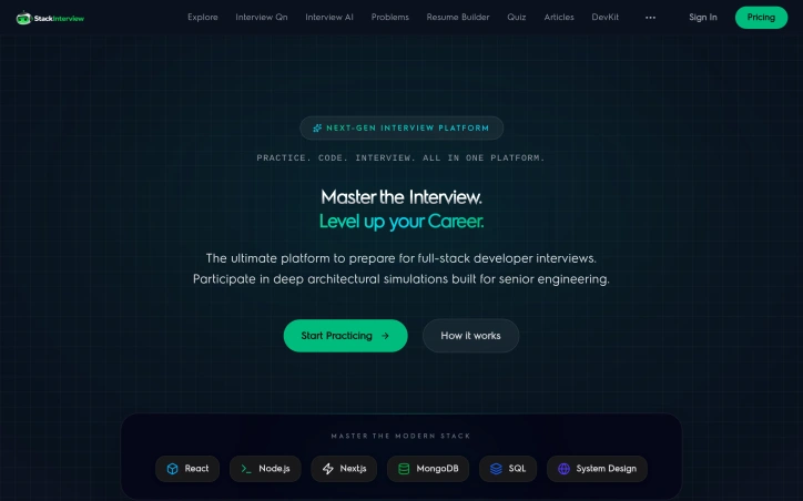
Preparing for technical interviews typically forces candidates into exhausting fragmentation: hunting for relevant questions across scattered blog posts, switching to separate coding platforms for DSA practice, and hoping they can communicate their thinking clearly during the actual interview. Stack Interview consolidates this workflow into a unified, free platform targeting developers aiming for senior-level roles. The platform tackles three specific pain points head-on. Its question bank of 1,000+ scenarios focuses on modern stack technologies—React, Node.js, Next.js, MongoDB, SQL, and system design—rather than generic definitions. These are architected around realistic problems candidates encounter in interviews at top companies. The second pillar, 215+ data structures and algorithms problems, comes with live code execution directly in the browser, eliminating the friction of local setup. Rather than leaving communication to chance, the platform includes an AI-driven mock interview feature that accepts voice input, scores responses across technical depth and communication clarity, and tailors questions to a candidate's selected target company. What distinguishes Stack Interview from existing interview prep resources is its scope consolidation. Most platforms optimize for one dimension—question banks, coding environments, or interview simulation. By integrating all three with supporting analytics like weakness tracking and company-specific readiness scoring, the tool reduces context switching and cognitive load during preparation. The business model reflects an unusual commitment to accessibility: everything is available for free with no paywall. The founder, a solo developer, built this after struggling with the exact inefficiencies the platform now solves. That origin story carries weight because the product solves real friction rather than imagined problems. The platform does target a specific audience. Candidates preparing for mid-to-senior roles in full-stack development will find the most value; those pursuing other specialties or junior-level positions may find the content overscoped. The voice-based AI interview feature, while innovative, lacks published data on performance across different accents, speech patterns, or technical communication styles. For developers serious about cracking interviews at competitive companies and tired of juggling multiple preparation tools, Stack Interview represents a meaningful consolidation. Its free-forever model removes friction to trying it, and its focus on architectural thinking over trivia aligns with how serious companies actually interview senior engineers.

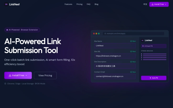
SEO professionals and independent bloggers often waste a significant amount of time manually submitting links to numerous websites, a task that involves tedious repetition of copying and filling out forms. LinkNest addresses this issue by providing an AI-powered browser extension that automates the process of identifying form fields and intelligently filling them with optimized content. The extension is designed to cater to the needs of SEO professionals and independent bloggers who seek to streamline their workflow and reduce the time spent on link submission. What stands out about LinkNest is its ability to significantly reduce the time required for link submission, from hours to mere minutes. Its AI-driven approach enables it to recognize and fill out form fields accurately, eliminating the need for manual data entry. The extension's capability to generate differentiated content and automatically detect the language of the target site further enhances its utility. LinkNest offers a range of features that make it an attractive solution for those involved in link building. Its floating menu allows users to access various capabilities, including filling out site information and generating virtual data. The extension also supports multiple profiles, enabling users to manage different sites and configurations efficiently. Additionally, its BYOK (Bring Your Own Key) mode allows users to utilize their own AI API key, providing flexibility in controlling costs. The pricing model for LinkNest includes a free version with limited functionality, a Pro version at $8 per month, and a Lifetime subscription for a one-time payment of $99. The free version has restrictions on the number of submissions and the number of links that can be managed, while the Pro and Lifetime versions offer unlimited submissions and links, along with additional features such as data import and export capabilities.