GeniusAI
Creative professionals and businesses struggling to generate high-quality visual content at scale now have access to a s...

Vehla
Streamlining workflows on Mac devices is a daunting task, especially when users have to juggle multiple utilities to acc...

Website Auditor
As artificial intelligence increasingly becomes the primary search method for consumers, most businesses remain invisibl...
Recently Listed
623 launches
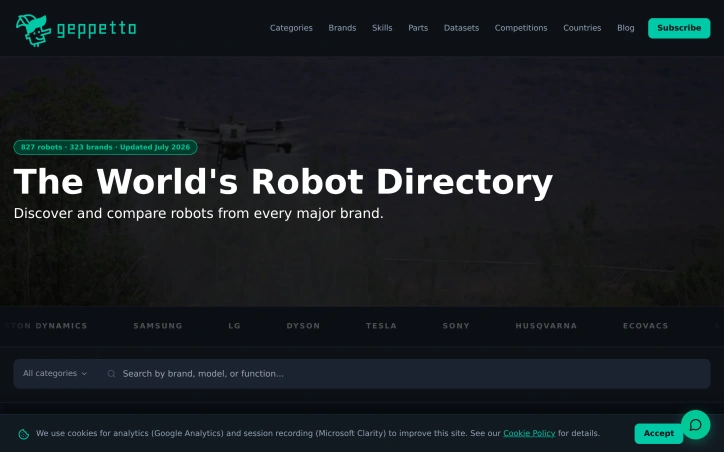
Navigating the robotics market has long been a fragmented experience, with specifications, pricing, and performance data scattered across manufacturer websites and trade publications. Geppetto addresses this fragmentation by consolidating information on over 800 robot models spanning 30+ categories into a single discovery platform. The service targets both commercial buyers evaluating robotic solutions and researchers mapping the landscape of available automation technology. The core value proposition centers on comparison and discovery. Rather than cobbling together information from multiple sources, users can access standardized specifications and pricing data across a broad range of robots. This centralization eliminates the manual research burden that typically precedes robotic procurement decisions. The platform's coverage across dozens of categories reflects an effort to serve diverse segments of the robotics market, from manufacturing and logistics to service and research applications. What distinguishes Geppetto from a simple product listing is its explicit focus on comparison functionality. The platform positions itself not merely as a directory but as an active research tool where users can meaningfully evaluate options side by side. This approach recognizes that robotic systems purchasing decisions involve complex technical tradeoffs and that buyers need structured data to compare performance characteristics and costs effectively. Rather than relying on isolated product pages, the platform enables systematic evaluation across multiple dimensions. The breadth of the catalog—800+ robots across 30+ categories—represents substantial curation work. Maintaining current specifications and pricing across such a range requires ongoing relationships with manufacturers and regular data verification. The platform must navigate the continuous product cycles that characterize robotics, where new models and capabilities emerge regularly. Staying current is essential to maintaining user value. The consolidation strategy addresses a genuine market need. Fragmentation currently forces buyers and researchers to conduct labor-intensive searches across disparate sources, consuming time and increasing the risk of incomplete evaluation. For anyone in the robotics procurement workflow, Geppetto offers a centralized alternative. In a market expanding rapidly with new entrants and capabilities, a unified reference point carries particular value.

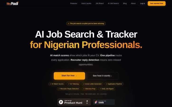
Job search platforms typically optimize for volume—more applications, more shots at the target. HirePadi inverts this approach by prioritizing precision instead. The service targets Nigerian professionals and job seekers across 20 countries who waste time applying to roles that don't match their profile, then wonder why rejections pile up without explanation. The core insight is straightforward: the job search problem isn't about working harder; it's about working smarter. Applicants spray resumes at dozens of postings and never learn whether they're genuinely competitive for each role. HirePadi addresses this by deploying AI to score how closely a candidate's CV aligns with each job, offering clarity before the application lands. The platform bundles this matching capability with three complementary features addressing friction points in traditional job search. CV tailoring automatically adapts resumes to individual roles rather than forcing applicants to use generic templates. Recruiter reply detection monitors Gmail in the background for offers, interview invites, and rejections, surfacing them before they vanish into inbox clutter—a practical safeguard against missed opportunities buried by volume. An application tracker keeps every application visible in a single pipeline, eliminating uncertainty about whether a rejection came via email weeks ago. HirePadi aggregates job listings from nine major platforms including LinkedIn, Indeed, and specialized boards like Remote.co and We Work Remotely, then delivers a personalized daily digest rather than requiring users to hunt across multiple sites. The service rounds out its feature set with cover letter generation and interview preparation tools, creating a workflow spanning discovery through interview. The positioning emphasizes getting real feedback instead of just recording "sent" notifications. Rather than measuring success by application count, the platform promises actual recruiter responses and visibility into whether a candidate is genuinely in contention. HirePadi operates a free model with no credit card requirement and claims setup takes roughly two minutes. No premium tier or paid upgrade is mentioned. The service fills a legitimate gap for job seekers frustrated by low conversion rates and unanswered applications, particularly in emerging markets where job search infrastructure remains fragmented. Whether the AI matching proves reliable and whether this approach genuinely converts to more interviews will determine whether the insight outweighs considerable competition in hiring tools.

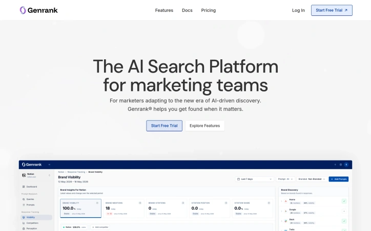
As AI language models increasingly serve as the starting point for buyer research and discovery, a gap has emerged in how brands monitor their presence in this new search frontier. Genrank addresses this directly by helping marketing teams understand and optimize how their companies appear in AI-generated responses from systems like ChatGPT. The platform recognizes that traditional search ranking, while still relevant, no longer captures the full customer journey. When potential customers engage with conversational AI to evaluate solutions or gather information, brands need visibility into whether they appear in those generated answers and recommendations. Genrank tracks this visibility across what the company frames as a "conversational funnel" distinct from keyword-based search results. The core offering includes several interconnected capabilities. Its LLM retrieval simulator shows how AI search engines chunk, retrieve, and rank content, revealing why certain brands appear prominently while others remain invisible. The platform monitors brand sentiment across news, reviews, and discussions that feed into AI recommendation systems. Its advertising insights feature surfaces which competitors are bidding on relevant prompts and what sponsored content appears alongside organic AI mentions. Content optimization tools help marketers adjust website pages and messaging to perform better within AI model retrieval processes. The social monitoring component tracks how brand perception shifts across the internet, connecting reputation signals to visibility in AI-generated answers. Genrank maintains a database exceeding 2.2 million brands, indicating established scale and reach. The platform serves multiple verticals including marketing agencies, e-commerce companies, recruitment organizations, and financial services. For agencies, it offers a competitive lever on a new dimension of visibility. For e-commerce, it addresses product discoverability in an era where price comparisons and research happen through chat interfaces. Recruitment and financial services can use the tool to become recommended options when AI systems generate career or financial guidance. Genrank targets a widening gap in the marketing technology landscape: most infrastructure was built for the age of search bars and keyword bidding. As conversational AI reshapes how people discover products and services, the platform helps teams understand and influence where and how their brands appear in these new customer conversations. The free trial model suggests accessibility for smaller teams alongside deeper offerings for enterprises.

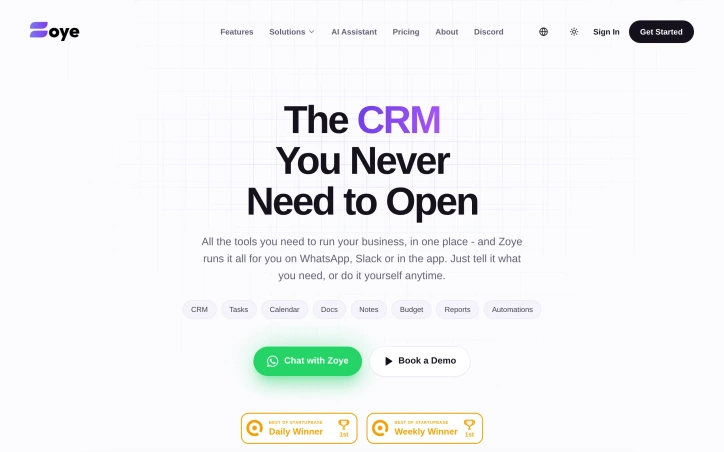
A fundamental frustration among founders and small business operators is the sprawl and complexity of managing multiple specialized software tools. Rather than forcing users to hop between platforms for CRM, task management, calendars, documents, and reporting, Zoye consolidates these functions into a unified interface accessible through conversational channels like WhatsApp and Slack, complemented by a traditional web application. The core innovation is architectural. Instead of requiring users to learn and navigate another complex dashboard, Zoye delegates operational workflows to an AI agent that executes tasks based on natural language instructions or predefined automations. A user can communicate with the system through existing communication channels rather than opening yet another browser tab. This directly addresses a pain point that resonates across the productivity software industry: tool fatigue and the cognitive overhead of context-switching between applications. The platform bundles traditional business functions—customer relationship management, task tracking, calendars, document storage, notes, budgeting, and reporting—alongside automation capabilities. This breadth positions it as a centralized operational hub rather than a single-purpose CRM. The company's blog content reveals vertical-specific marketing efforts, including targeted guides for real estate agents, fitness professionals, legal practitioners, and event organizers, indicating the product has been adapted to support workflows beyond generic sales and customer service. Zoye targets a specific niche: resource-constrained startups and small businesses where hiring dedicated operations staff remains impractical. For this audience, the value proposition is compelling. An AI-managed CRM eliminates the traditional setup and ongoing management burden that discourages many founders from implementing structured customer workflows at all. Notably, the positioning emphasizes what the product does not require: opening the application itself. This inverts the typical software experience where the application is the primary interface. Whether this approach proves sufficient for teams needing deeper analysis, complex custom workflows, or extensive collaboration remains an open question. The reliance on conversational interfaces depends heavily on the quality and consistency of the underlying AI, which directly determines whether the system reliably interprets and executes business-critical operations. The company provides a live preview and demo booking, though no pricing is disclosed publicly, suggesting a sales-driven motion typical of B2B SaaS targeting SMBs.

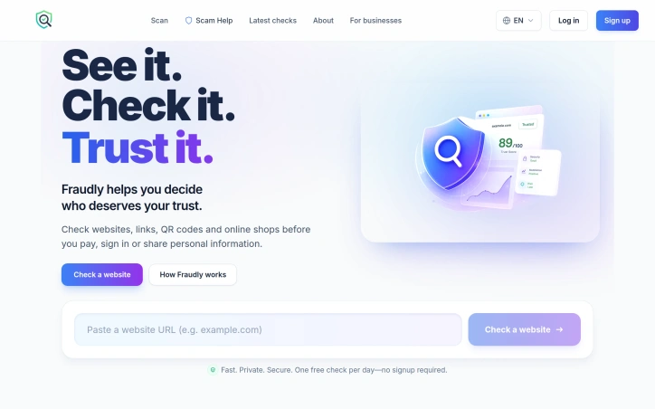
Securing online transactions before they happen addresses a real gap in consumer safety. Fraudly tackles the moment between seeing a link or storefront and deciding whether to trust it with money, credentials, or personal information. The product targets everyday internet users—shoppers, email checkers, QR code scanners, social media link-followers—who encounter suspicious websites constantly but lack reliable tools to evaluate legitimacy in seconds. The core differentiator centers on explainability. Rather than hiding behind opaque risk scores, Fraudly breaks down trust signals across specific dimensions like website safety, business reputation, and shopping intelligence. Users see the reasoning behind each assessment, enabling them to make informed judgments rather than blindly accepting automated warnings. This design philosophy extends beyond marketing; the company explicitly positions itself against unnecessary fear-mongering, acknowledging that not every website fits neatly into safe or unsafe categories. The product reaches users across multiple contexts. The web interface handles website checks with one free analysis daily, no signup required. A mobile app extends functionality to pasted links from messages and emails, QR code scanning in parking lots and cafes, and screenshot analysis—catching suspicious links embedded in images users receive. Browser extensions for Chrome and Microsoft Edge offer passive protection, warning users during normal browsing rather than forcing manual checks. Privacy forms another stated pillar. Unlike many security tools that build detailed browsing profiles, Fraudly commits to not tracking users or commercializing their activity data. This matters because trust products themselves become targets if they collect and monetize user behavior. The Trust Profile synthesizes analysis from multiple established security sources using AI, combining rather than inventing conclusions. The company positions this as stronger than manually researching across separate services. The website reveals little about accuracy rates, false positive performance, or how it handles emerging scams. A sample Trust Profile shows a four-star rating with an 84 confidence score, but public examples don't illuminate edge case handling. The free tier caps users at one daily check, which may frustrate power users or security professionals needing unlimited access. No premium pricing appears on the site. For consumers tired of making trust decisions blindly, the product delivers focused value that explains itself.

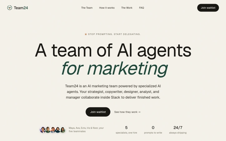
Marketing teams today operate in a state of constant tool sprawl. They switch between ChatGPT for strategy, Claude for copy, Midjourney for visuals, and a dozen analytics dashboards, each requiring separate logins and repeated context. Every transition means re-explaining the brief, starting over with new prompts, and losing the thread of prior conversations. This creates friction that makes it harder for marketing departments to move quickly, even with AI assistance. Team24 attacks this inefficiency by consolidating an entire marketing team into Slack, the communication hub most marketing organizations already inhabit. Rather than routing requests to different tools, users message a shared Slack channel and receive work from five specialized AI agents: a strategist who sets positioning and messaging, a copywriter who produces copy and email sequences, a designer who builds landing pages and ad creatives, an analyst who tracks performance, and a manager who orchestrates the workflow. Each agent has a distinct persona and expertise, and they collaborate with each other to produce integrated deliverables without additional user guidance. The key differentiator is not the individual agents but the internal collaboration between them. A copywriter doesn't write in isolation; the strategist's positioning informs the copy, which then informs the designer's creative direction, which feeds back to the analyst's recommendations. This interdependence mirrors how a real marketing team works, except all conversation and file sharing happens in a single thread with shared context preserved throughout. The product delivers finished work, not suggestions. Users submit a brief like "Launch our Q3 product to mid-market SaaS buyers," and Team24 returns completed landing pages, ad campaigns, positioning decks, and performance reports. This stands in contrast to most AI tools that generate drafts requiring further refinement and assembly. The emphasis on delivery over iteration changes the value proposition: instead of augmenting a marketer's output, Team24 positions itself as a replacement for routine marketing work. The product covers a comprehensive marketing workflow spanning strategy, copywriting, design, paid media, email marketing, and analytics. For bootstrapped startups and small-to-mid-market companies that lack dedicated marketing teams, this consolidation could reduce both tool costs and cognitive load. For larger departments, Team24's value hinges on how well the AI's output meets brand standards and performance expectations. No pricing details are disclosed in available materials, leaving the business model unclear. Whether Team24 charges per request, by subscription, or through other models will significantly affect adoption decisions for budget-constrained teams.

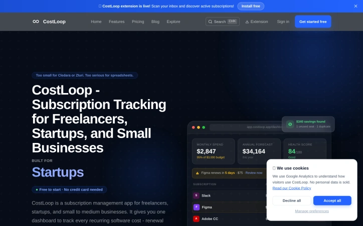
Managing software subscriptions is a daunting task for freelancers and small to medium-sized businesses, often resulting in lost renewal dates and unnecessary costs. CostLoop addresses this issue head-on by providing a straightforward dashboard to monitor recurring software costs. The product is designed specifically for freelancers, startups, and small to medium businesses, offering a simple solution to track SaaS subscriptions and manage spend. By consolidating renewal dates, monthly spend totals, invoice storage, and cancellation links in one place, CostLoop simplifies the process of keeping on top of software expenses. One standout feature is the Chrome extension, which scans the user's inbox to discover active subscriptions, eliminating the need to manually log every SaaS tool. This automation is a significant time-saver, allowing users to quickly gain a clear picture of their monthly and annual spend. Additionally, the platform provides automatic email reminders before subscriptions auto-renew, ensuring users never miss a renewal date. The product's key features include a centralized dashboard for tracking subscriptions, renewal reminders, and invoice storage. It also identifies potential savings opportunities, such as unused seats and duplicate subscriptions. Notably, the platform is free to start, with no credit card required, and setup is accomplished in just two minutes. Users can track over 100 SaaS tools, and the platform has already managed 8,200+ subscriptions, with an average savings of 18% after the first audit. While pricing details beyond the free plan are not explicitly mentioned, the absence of a required credit card upfront is a welcome feature for users hesitant to commit to new services. Overall, CostLoop presents a compelling solution for businesses seeking to streamline their software subscription management and reduce unnecessary expenses.

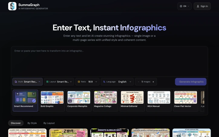
Transforming text into visually appealing infographics is a task that marketers, educators, creators, and students often struggle with, due to the need for design skills and software expertise. A new AI-powered solution addresses this challenge by enabling users to generate high-quality infographics from plain text in seconds. At its core, this product leverages artificial intelligence to read the content, understand its structure, and create a unique visual representation from scratch. This approach ensures that every output is tailored to the message being conveyed, rather than relying on recycled templates. The result is a polished and readable infographic, even when dealing with dense content. What stands out about this product is its ability to offer a high degree of customization, with 17 active visual styles and 20 layout systems that can be combined to produce 340 different combinations. The AI also provides Auto recommendations to simplify the process. Additionally, the product supports 9+ output languages, making it a versatile tool for a diverse user base. The process of creating an infographic is streamlined into three steps: pasting the text, choosing a style and layout, and publishing the visual. The product can handle various types of content, including articles, notes, and research summaries. For longer content, a Series Mode feature allows users to split it into 2-10 connected pages. Users can access the product with free starter credits, and for higher-volume usage, one-time credit packs are available in Lite and Pro options. Overall, this AI-powered infographic generator offers a powerful solution for users seeking to create professional-looking visuals without requiring extensive design experience.

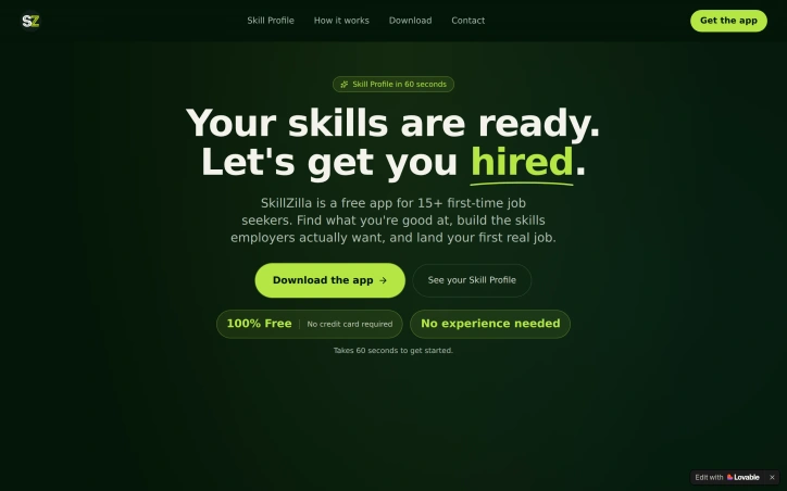
Addressing a genuine gap in first-time job seeker support, this free application helps youth identify their strengths and translate them into employability. Created by parents frustrated with their own children's readiness for work, the app targets the 15-plus crowd who feel lost navigating the job market without guidance on what they're actually good at. The core offering centers on a Skill Profile generated in about 60 seconds. Rather than forcing users through lengthy personality quizzes, the app identifies personal archetypes—like "The Spark," characterized by quick thinking and initiative—and frames these natural tendencies as marketable strengths. This reframing is the product's clever insight: young people don't need fixing; they need to see themselves clearly and understand where their instincts take them. Beyond self-discovery, the application builds practical job-readiness skills through short daily exercises. The focus lands on concrete capabilities employers actually care about: crafting interview answers that sound natural, writing effective emails, and articulating personal strengths without cringing. This moves beyond generic career advice into specific skill-building. The product pipeline flows logically from profile to application. An auto-generated resume pulls from the Skill Profile in plain language, avoiding the buzzword-laden templates that frustrate both hiring algorithms and hiring managers alike. Job recommendations appear curated to user strengths rather than presented as an overwhelming feed. An integrated application tracker consolidates every submission in one place, replacing spreadsheets and lost threads. Design-wise, the app explicitly targets a neurodivergent and anxious audience. The emphasis on calm interfaces, step-by-step clarity, and minimal busywork stands out in a job-search market typically designed for users comfortable with complexity and self-direction. There's no infinite scroll, no gamification fatigue, just progression: discover, train, build, apply. The business model removes friction entirely: the app is free, requires no credit card, and asks nothing upfront. For teens and young adults with minimal financial resources, this eliminates a common barrier to trying new tools. User testimonials hint at meaningful outcomes. One user credits the app with finding direction and pursuing an international opportunity. While sample sizes matter for drawing conclusions, these narratives suggest the product delivers results beyond engagement metrics. For first-time job seekers overwhelmed by traditional career platforms, the application offers a genuinely different approach grounded in practical psychology and realistic skill development.

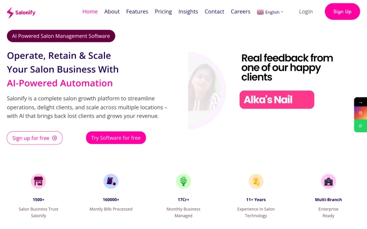
Salon and spa owners typically juggle contradictory demands: they want to focus on clients and service quality but find themselves drowning in administrative tasks instead. From appointment tracking to staff coordination to inventory management, the operational overhead steals time from what actually matters. Salonify targets this exact pain point, positioning itself as a unified management platform designed to free salon owners from spreadsheets and fragmented systems. The product stands out for its origin story and design philosophy. Rather than being built by consultants studying the industry from afar, Salonify grew from a direct conversation with a salon owner frustrated by no-shows and manual scheduling. This grounding in real problems shapes its approach: the company commits to ongoing development based on feedback from its 1,500+ active salon users, treating software updates as a response to operator needs rather than predetermined roadmaps. The feature set is comprehensive. The platform offers multi-branch management for chains alongside role-based access controls that let different team members operate separate applications, from owner dashboards to staff-facing interfaces. Core capabilities include point-of-sale and billing, inventory tracking, membership and package management, and payroll integration. On the operational side, Salonify provides analytics and growth reports, loyalty programs, and attendance tracking. GST-ready reporting acknowledges India's regulatory requirements directly. The AI component, called SIA, distinguishes the offering. Beyond traditional salon software, Salonify integrates voice-powered assistance with regional language support for data queries and business insights. It includes AI-driven client retention features that identify at-risk customers and initiate re-engagement, and an AI-powered hair style preview tool that lets clients visualize cuts and colors before commitment. Business WhatsApp integration keeps communication inside a branded channel rather than scattered across messaging apps. The platform emphasizes unlimited users and employees across its four applications without explicit tier-based restrictions. Over 160,000 monthly bills processed and 17 crores in monthly business managed by users suggests meaningful adoption. No pricing details appear in public materials, which is typical for India-focused SaaS but leaves purchase decision transparency unclear. The company offers free monthly growth webinars, positioning support as part of its value delivery. For salon owners struggling with legacy systems or spreadsheets, Salonify delivers operational consolidation paired with AI features that address client experience directly. The grounded approach to product development, rooted in actual user struggles, gives it credibility in a market often dominated by generic salon software.

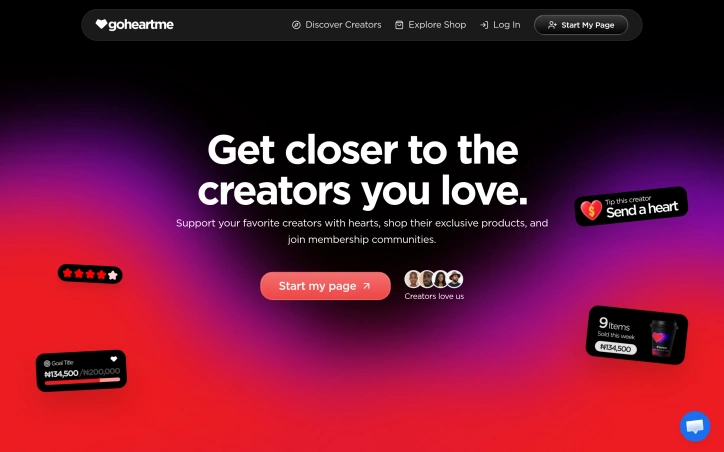
Audience-backed funding for creators remains an underserved market in many regions, particularly in Africa where traditional payment infrastructure and global platforms create barriers to monetization. This creator support platform directly addresses that gap by offering a unified solution for individuals and communities to receive financial backing from their audiences. The platform consolidates several monetization mechanisms into one ecosystem. Creators can establish personalized pages, accept one-time contributions from supporters, or build recurring revenue through membership offerings. The addition of digital product sales extends utility beyond simple patronage, allowing creators to package and distribute content or services alongside direct support. This multi-model approach recognizes that different creators and audiences have different transaction preferences—some favor one-off tipping while others commit to ongoing relationships. What distinguishes this offering is its explicit focus on African markets. Rather than assuming global payment solutions serve all regions equally, the platform prioritizes secure payment infrastructure tailored to local contexts and economic realities. The emphasis on ease of use reflects recognition that not all creators possess technical sophistication or familiarity with complex funding platforms. The public support links feature enables easy sharing across social channels and messaging platforms, reducing friction in the discovery and conversion funnel. This addresses a real challenge: even creators with engaged audiences often lack straightforward ways to direct that engagement into revenue. The positioning centers on simplification—both of the payment process and the user experience. The platform focuses creators on a core workflow: set up, share, receive funds. Rather than overwhelming users with analytics dashboards or complex configuration options, it prioritizes directness. The website itself offers limited operational details about pricing, transaction fees, or specific payment methods supported, making competitive positioning on cost and full feature set difficult to assess. The duplicate phrasing in the founder's description indicates the company is still refining its messaging. For creators seeking an alternative to global platforms, particularly those based in Africa or serving African audiences, this represents a focused solution. The combination of multiple revenue models and geographic specificity reflects a product built with particular user needs in mind rather than as a generic clone of existing solutions.

Digital detectives, travel enthusiasts, and competitive GeoGuessr players now have a dedicated tool for solving one of modern photography's central mysteries: determining exactly where an image was captured when traditional metadata trails have gone cold. WhereWasTaken addresses a genuine gap in image analysis by treating photo geolocation as a visual puzzle rather than a data-retrieval problem. Where reverse image search relies on finding identical or similar images online, this tool takes a fundamentally different approach by training its AI on geographic patterns themselves. It examines landmarks, architectural styles, road signage, vegetation types, terrain characteristics, and environmental conditions visible in a photograph to triangulate the most probable location. The product targets three distinct user groups clearly. Travelers use it to verify or understand the context of photos they've captured. Content creators benefit from identifying locations in images before sharing them. GeoGuessr players, who compete by pinpointing locations from Street View screenshots and similar imagery, find it particularly useful since those images often lack usable metadata. Several features distinguish the offering. The interface emphasizes speed and accessibility through drag-and-drop upload, handling JPG, PNG, and WEBP formats up to 10MB. The system doesn't simply output a location; it provides confidence scoring and identifies the specific visual clues that informed its prediction, giving users insight into how the AI reasoning worked. The examples displayed show real analyses with confidence percentages and demonstrate the types of landmarks the system recognizes, from iconic structures like the Eiffel Tower to regional markers like road designations in Argentina. The platform claims coverage across 56 countries and cites statistics around accuracy and volume of images processed, though these figures derive from the company's own marketing materials. The offering also expands into related functionality for viewing EXIF metadata and geotagging photos, suggesting a broader strategy around photo location intelligence. The product fills a genuine need for anyone working with decontextualized images, particularly as privacy concerns push more people toward removing location data before sharing. Whether the AI's predictions hold up in rigorous independent testing remains an important question before relying on it for professional or mission-critical use cases.


Creating floor plans typically requires either hiring expensive professionals or struggling through clunky CAD software. AI House Plan addresses this gap by automating the initial conceptualization stage, letting homeowners, interior designers, architects, and property teams explore spatial arrangements through conversation rather than technical drawings. The tool works through a straightforward workflow: users describe their space requirements or upload an existing sketch, photo, or site outline. The system then generates floor plan visualizations that can be refined iteratively. This hybrid approach of text prompts plus optional reference images gives it genuine flexibility. Someone with only a rough idea can start with description alone, while someone with an existing layout can use it as a foundation for modification. What distinguishes this product is its focus on style variety and conversational refinement. Rather than producing a single technical drawing, it generates comparable options in different aesthetic directions: 2D technical layouts, 3D furnished visualizations, isometric presentations, or minimal line drawings. This lets users explore how their requirements look under different design philosophies before committing to professional work. The ability to re-upload generated plans with new prompts treats the tool as iterative rather than one-shot, enabling genuine back-and-forth refinement. The preset templates for common scenarios—a 150-square-meter house, 90-square-meter apartment, 250-square-meter office, 180-square-meter restaurant—lower the barrier to getting started. Users can describe specific requirements like bedroom count, bathroom count, entrance location, open-concept preferences, and adjacency constraints. This level of control suggests the AI understands spatial logic beyond simple pattern-matching on typical layouts. The intended workflow bridges the gap between initial ideation and professional architectural consultation. Homeowners can validate their thinking, designers can explore variations faster, contractors can visualize existing properties with modifications, and property teams can test multiple configurations without hiring multiple design consultants. One limitation of the available information is opacity around accuracy and validation. There is no mention of how the tool handles structural requirements, building codes, or whether generated plans are actually buildable. For casual exploration or interior design concepting, this may not matter. For any serious architectural work, users would still need professional review before acting. The business model remains unstated, leaving unclear whether this operates as a paid subscription, usage-based pricing, or freemium tier.


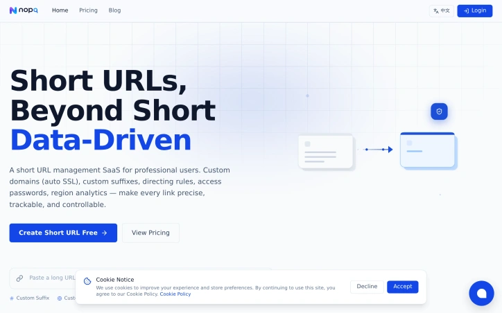
Professionals managing marketing campaigns and brand presence increasingly need control over their links. Standard URL shorteners offer basic shortening without the infrastructure necessary for sophisticated campaigns, brand consistency, or actionable insight into link performance. NOPQ positions itself as a link management platform rather than a simple shortening tool, targeting teams that require custom branding, detailed analytics, and dynamic routing capabilities. The platform distinguishes itself through three core pillars: brand ownership, traffic control, and transparent analytics. On the branding side, users can attach custom domains with automatic SSL certificate provisioning, ensuring every shortened link reflects their brand rather than a generic shortener domain. The routing engine allows sophisticated traffic distribution—URLs can direct visitors based on language preferences, conduct A/B testing through randomized splitting, or apply weighted priority rules that funnel different audiences to different destinations through a single link. Analytics constitute another primary differentiator. The dashboard tracks visits, unique IP counts, geographic distribution down to city-level granularity, device and browser breakdowns, referrer sources, and temporal trends. This depth of insight goes beyond typical link shortener offerings, enabling campaign teams to understand not just how many people clicked, but who clicked and from where. Feature completeness rounds out the offering. Access controls include password protection, expiration dates, and click limits. Link customization extends to custom suffixes and organizational grouping. The platform supports multiple rules per link, with free users limited to one rule per link. The business model keeps complexity low. A free tier allows 10 short links with basic functionality, suitable for light personal use. The VIP tier, priced at $2 per 30 days, unlocks unlimited links and rules, extended data retention, and three custom domains. An enterprise custom tier addresses team collaboration, independent deployment options, API integration, and SLA guarantees, though specific pricing remains negotiable. NOPQ's positioning reflects a market shift toward link management as infrastructure rather than link shortening as utility. For teams running campaigns, managing multiple brands, or requiring campaign attribution, the platform offers genuine capability. The transparent pricing and clear feature differentiation acknowledge that users have legitimate needs across scales. Whether the feature depth justifies adoption overhead for lighter use cases is a secondary consideration—the platform clearly targets professionals with concrete requirements.

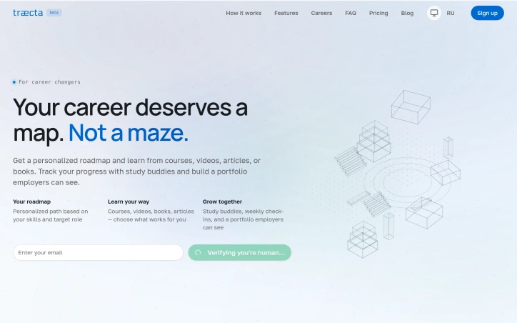
Career changers typically encounter a universal problem: most learning platforms treat all students the same, forcing them through content they've already mastered while ignoring their existing foundation. Traecta addresses this friction by building personalized learning roadmaps designed specifically for professionals transitioning between industries. The platform targets career switchers moving from roles like design to frontend development, accounting to data analysis, or teaching to technical writing. Rather than presenting exhaustive course libraries, Traecta constructs adaptive learning paths that skip redundant material and focus exclusively on skill gaps. This respect for prior experience cuts through the cognitive overload that plagues traditional online learning. What distinguishes Traecta centers on its three-stage framework. Users spend two minutes answering questions about their current skills and target role, receive an instant personalized roadmap, then track progress through concrete milestones. The platform emphasizes practical work—learners complete projects, upload portfolios, and build demonstrable proof of competency that employers can evaluate directly. This portfolio-first approach directly challenges the certificate-heavy model dominating the industry. The platform incorporates several features that reinforce this philosophy. Users select from multiple learning formats—courses, videos, books, articles—rather than following a prescribed sequence. This flexibility acknowledges that different professionals absorb knowledge differently. A skill profile maps abilities across multiple dimensions, giving learners visibility into exactly where they stand and what to prioritize next. Community elements add another layer. Study buddies and weekly check-ins connect learners pursuing the same career transitions, replacing the isolation of self-directed online education with peer accountability and feedback. This acknowledges an often-overlooked factor: career changes succeed more reliably when accompanied by social reinforcement. The underlying proposition cuts against convenience and completeness, two temptations in digital education. Traecta deliberately excludes irrelevant material and emphasizes depth over breadth, betting that professionals changing careers want precision over choice paralysis. Whether this translates to measurable results—faster transitions, higher retention, better employment outcomes—remains to be demonstrated in practice. But the fundamental insight driving the product resonates: career development, especially across industries, demands customization, not commodification.

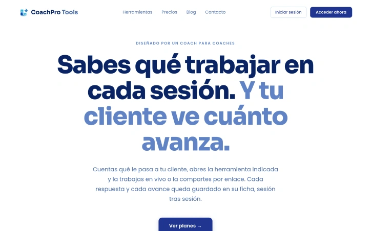
Managing a coaching practice involves juggling multiple moving parts—client files, session notes, appointment scheduling, follow-up exercises—that often pull attention away from actual coaching. CoachPro Tools consolidates these functions into a single platform designed specifically for the realities of coaching work. Built by a coach for coaches, the platform addresses the administrative overhead that fractures focus during and between sessions. The core value proposition is straightforward: coaches open a single tool when a client issue surfaces, work through it interactively in real time, and have everything saved to the client's file automatically. A coach using the system notes that session documentation happens live in the platform rather than requiring after-call transcription into notes. The feature set reflects this practice-focused design. Each client gets a dedicated workspace with session history, agreements tracked on a Kanban board, a timeline of progress and milestones, and access to over 249 built-in interactive tools—frameworks like the Wheel of Life and SWOT analysis, all integrated into the interface. Coaches can run tools during screen-shared sessions or send them via link for clients to complete between appointments. The platform also includes a calendar, video calling, public booking links, and practice statistics. A notable addition is WhatsApp integration powered by an AI agent. Coaches connect their WhatsApp number to the platform, configure it with their own pricing, hours, FAQs, and booking link, and an AI agent responds to client inquiries automatically. The coach continues to see and manage every conversation from within the platform. The AI can run on Claude, OpenAI, or Gemini, with the coach providing their own information so responses stay grounded in the coach's actual offerings. The onboarding claim promises zero setup time requiring no technical knowledge. The platform operates on a subscription model with plans available and a 30-day money-back guarantee, though the marketing material does not specify pricing. The company mentions lifetime access options, suggesting confidence in long-term retention. The target audience concentrates in Latin America and Spain. The integration of session tools, client management, scheduling, and AI-assisted support in one interface addresses a real operational gap for coaches managing multiple clients while handling administrative workflows.
Affordable test preparation for Canada's immigration pathway has long been a gap, particularly for the PTE Core English exam now accepted by Immigration, Refugees and Citizenship Canada (IRCC). This platform fills that gap by offering 1,412 real exam questions with instant AI-powered scoring—entirely free for daily practice without requiring a credit card. The service targets Express Entry applicants and skilled workers navigating Canadian immigration requirements, where English proficiency directly impacts Comprehensive Ranking System points and eligibility. The platform's core strength lies in its use of authentic exam questions sourced from real PTE tests, combined with AI scoring that delivers instant feedback on pronunciation and fluency. This matters because applicants face significant financial barriers and preparation gaps; traditional exam prep can be expensive, and affordable alternatives have been scarce. What differentiates this offering is its specificity. Rather than generic English learning, every task mirrors the official exam structure: Read Aloud, Repeat Sentence, Describe Image, Write Email, and others spanning all 19 PTE Core task types. Users can focus on their weakest skills rather than preparing across all four domains simultaneously, an approach validated by the testimonials provided—one user raised their Listening score by 12 points in two weeks, another achieved CLB 9 across all skills in six weeks. The interface is built for practical learner constraints: mobile-ready design accommodates users practicing between shifts, detailed analytics track progress in specific competencies, and the daily free practice model removes financial barriers to getting started. The stated commitment to privacy—audio data processed securely and never sold—addresses a reasonable concern for users recording voice samples. The platform serves 2,000+ learners and incorporates community-contributed exam questions, expanding its real-question bank over time. For Canada PR applicants with limited preparation budgets, genuine exam familiarity needs, or specific skill gaps, this addresses a legitimate pain point in the immigration preparation ecosystem. The combination of real questions, task-focused practice, and free daily access creates a compelling alternative to traditional test-prep models.


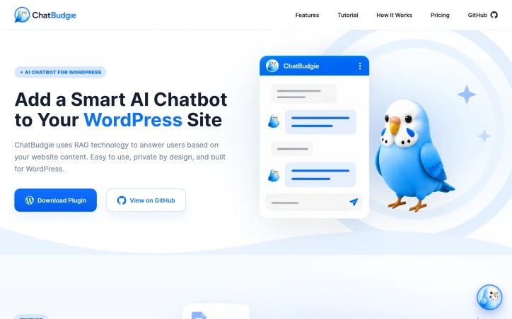
WordPress site owners constantly wrestle with the dual challenge of providing responsive customer support while keeping visitors engaged. Traditional AI chatbot solutions compound this problem by demanding complex API integrations, ongoing maintenance, and technical expertise that most website administrators lack. This plugin addresses that friction directly. Rather than pulling answers from the general internet, it uses retrieval-augmented generation (RAG) to ground responses in a site's actual content, delivering answers that are both accurate and contextually relevant to the business. This architecture shift eliminates the accuracy problems that come with generic AI responses while building customer trust through transparent sourcing. The implementation philosophy prioritizes simplicity over feature complexity. Setup takes minutes without requiring API key management or external service coordination. The chatbot automatically maintains its knowledge base as site content updates, removing the burden of manual retraining or version management that plagues other solutions. There is no server to configure, no backend infrastructure to oversee. Privacy by design is another differentiator. Because the system works within a WordPress site's own ecosystem and relies on its own content rather than third-party AI services, data handling remains under the site owner's control. This matters for businesses with privacy-conscious audiences or compliance requirements. The business model reflects this accessibility-first approach. Rather than adopting the software-as-a-service subscription model that dominates the chatbot space, the product uses one-time token purchases. A light-usage tier starts at $4.95 for five million tokens, with mid-range and high-volume options at $19.50 and $95 respectively. These purchases do not expire, and there are no hidden recurring fees. For WordPress operators with limited budgets or unpredictable chatbot usage, this removes the calculus of committing to monthly subscriptions. The product targets a specific underserved segment: small to medium WordPress sites that need support automation but lack the technical resources or budget for enterprise solutions. It does not promise to replace human support entirely, but rather to handle routine inquiries, reduce response time pressure on small teams, and create a more polished visitor experience. For that narrow use case, it presents a genuinely different approach to a common pain point.
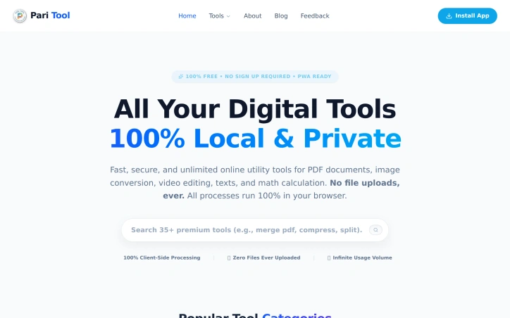
Professionals and casual users constantly face the need for quick file conversion, document manipulation, and utility operations, yet existing solutions fragment across paid subscriptions, sketchy free services that upload data to servers, and desktop software that requires installation. Pari Tool addresses this gap with a collection of over 35 browser-based utilities that operate entirely on the user's device, eliminating privacy concerns and eliminating the need for account creation or payment. The core distinction of this product lies in its execution model. All processing happens client-side within the browser, meaning files never leave the user's computer. This architecture removes the fundamental trade-off that has long plagued free online tools: either accept that your files travel to someone's server, or pay for privacy. For users managing sensitive documents—tax records, personal photos, confidential PDFs—this distinction matters considerably. The tool also operates as a progressive web application, allowing installation directly from the browser without app store intermediaries. The feature set spans practical categories. PDF functionality covers merging multiple documents, splitting or extracting specific pages, compression, format conversion to images, password protection, and annotation editing. Image tools handle resizing, cropping, background removal, watermarking, and conversion between WebP, PNG, JPG, and PDF formats. Video utilities compress footage, convert between formats (MP4 to MOV), extract audio, and transform clips into animated GIFs. Beyond media, the platform includes text utilities for word counting and reading-time analysis, case conversion, batch find-and-replace operations, and duplicate removal. Specialized tools cover QR code and barcode generation, JSON formatting, file encryption with AES protection, ZIP compression, and practical calculators for EMI and tax invoice generation. What remains unstated but obvious: the business model assumes either a future monetization pivot or funding already in place. The product explicitly commits to remaining free with unlimited usage, which creates questions about sustainability that the available information doesn't address. The strength of Pari Tool lies not in algorithmic innovation but in practical consolidation. Rather than requiring users to bounce between a dozen specialized sites, it centralizes commonly needed operations in a single, privacy-respecting interface. For anyone regularly handling documents, images, or video files, the convenience factor alone—combined with the removal of upload anxiety—positions this as a genuinely useful addition to the web utility landscape.

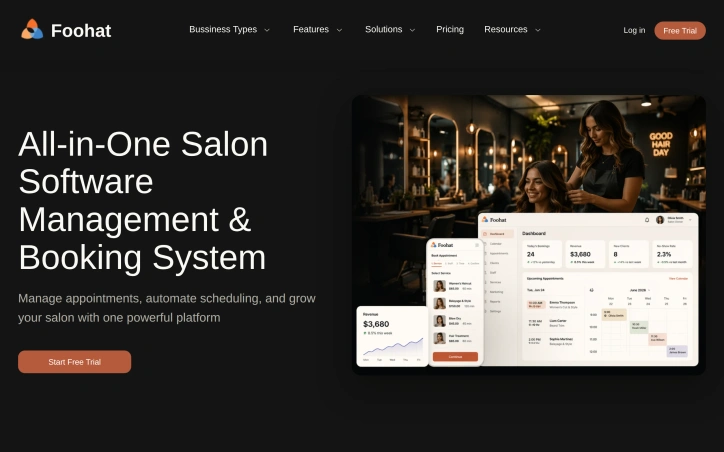
Salon owners typically face a familiar frustration: their days are consumed by administrative work rather than serving clients. Foohat targets this exact pain point by offering an all-in-one management platform designed specifically for beauty, wellness, and fitness businesses. The platform addresses several core operational challenges that salon owners encounter. Excessive no-show rates, scattered customer data, manual scheduling conflicts, and the constant interruption of phone calls during client services drain both productivity and revenue. Foohat's solution combines online booking, smart scheduling, and automated reminder systems to tackle these issues systematically. The 24/7 booking capability reduces dependency on phone-based reservations, while automated client reminders help lower no-show rates significantly. What distinguishes Foohat is its vertical specificity. Rather than offering generic appointment software, it recognizes that different service businesses have fundamentally different needs. A nail salon's operations differ markedly from a yoga studio's, which requires different workflows than a barbershop. The platform accommodates this with industry-tailored features: chair rental management for salons, hydrotherapy room assignment for spas, reformer equipment tracking for pilates studios, and lane assignment for swimming facilities. This granularity extends to pricing models, with breed-specific service menus for pet grooming and size-based tier pricing. Beyond scheduling, Foohat bundles comprehensive business management tools. The platform includes point-of-sale functionality, inventory tracking, staff scheduling, and analytics dashboards that provide visibility into business performance. Marketing features like text and email campaigns, membership management, and loyalty programs help owners move beyond basic operations to revenue growth. The platform's approach evolved from direct salon owner feedback. The founder's insight came from observing that the industry's core problem wasn't complexity but administrative overhead preventing talented professionals from focusing on their craft. This explains why Foohat emphasizes time-saving automation rather than adding unnecessary features. The company offers a free trial, suggesting an accessible entry point for owners evaluating solutions. No specific pricing details were disclosed in available materials, so prospective customers would need to engage directly to understand cost structure for their particular business type and scale. Foohat positions itself as a complete operating system for salon and wellness businesses, solving the fragmentation that currently forces owners to juggle multiple tools while missing opportunities for growth.