1,034 startups launched 12,714 upvotes cast 58 submitted this week

Recently Listed

1,034 launches
Sort
Doodara

Personalized children's picture books typically require either significant expense or design expertise—two barriers that most families lack. Doodara removes both by generating illustrated storybooks in minutes from a single photograph, requiring neither sign-up nor payment. The product's strongest asset is its frictionless entry point. Users upload a photo, select from twenty story templates or write their own premise, choose from sixteen art styles ranging from watercolor to pixel art, and the AI generates a complete book with consistent character illustrations throughout. The entire process completes in minutes, with no account creation necessary. This approach democratizes book creation: parents and caregivers can produce polished, personalized stories their children actually feature in—something previously limited to custom book publishers with premium pricing. The execution details matter. The service handles character consistency across pages, a non-trivial problem in generative AI that often produces jarring inconsistencies. It offers multiple output formats: flipbook previews for immediate sharing, downloadable PDFs for printing, and various aspect ratios optimized for different devices. These aren't afterthoughts; they embody the founder's core belief that giving each child the experience of starring in their own narrative deserves accessible tools. The service has generated over 2,400 books and demonstrated strong user adoption. The business model uses freemium monetization: the free tier delivers complete functionality using a standard AI model, while paid plans unlock an advanced model option, commercial usage rights, and additional printing services. This approach positions the free tier as a legitimate product, not a limited trial designed to frustrate users into upgrading. What remains unclear from the marketing materials is how consistently the AI handles edge cases—children of different ethnicities, more complex story concepts, or unusual art style combinations. The consistency promise is strong, but edge case performance determines whether this remains genuinely inclusive for all families. Doodara solves a real problem in an elegant way. It eliminates the skill, cost, and complexity barriers that prevented most families from creating personalized books. The free tier is genuinely unlimited and functional, making this accessible to households of any income level. For parents seeking a memorable way to put their child at the center of a story, this tool delivers.

Ai-generative-media
G
Guaiss Wang

Personalized children's picture books typically require either significant expense or design expertise—two barriers that most families lack. Doodara removes both by generating illustrated storybooks in minutes from a single photograph, requiring neither sign-up nor payment. The product's strongest asset is its frictionless entry point. Users upload a photo, select from twenty story templates or write their own premise, choose from sixteen art styles ranging from watercolor to pixel art, and the AI generates a complete book with consistent character illustrations throughout. The entire process completes in minutes, with no account creation necessary. This approach democratizes book creation: parents and caregivers can produce polished, personalized stories their children actually feature in—something previously limited to custom book publishers with premium pricing. The execution details matter. The service handles character consistency across pages, a non-trivial problem in generative AI that often produces jarring inconsistencies. It offers multiple output formats: flipbook previews for immediate sharing, downloadable PDFs for printing, and various aspect ratios optimized for different devices. These aren't afterthoughts; they embody the founder's core belief that giving each child the experience of starring in their own narrative deserves accessible tools. The service has generated over 2,400 books and demonstrated strong user adoption. The business model uses freemium monetization: the free tier delivers complete functionality using a standard AI model, while paid plans unlock an advanced model option, commercial usage rights, and additional printing services. This approach positions the free tier as a legitimate product, not a limited trial designed to frustrate users into upgrading. What remains unclear from the marketing materials is how consistently the AI handles edge cases—children of different ethnicities, more complex story concepts, or unusual art style combinations. The consistency promise is strong, but edge case performance determines whether this remains genuinely inclusive for all families. Doodara solves a real problem in an elegant way. It eliminates the skill, cost, and complexity barriers that prevented most families from creating personalized books. The free tier is genuinely unlimited and functional, making this accessible to households of any income level. For parents seeking a memorable way to put their child at the center of a story, this tool delivers.

Doodara preview

Key features

  • AI Storybook Generation: Generates illustrated storybooks in minutes from a single photograph
  • No Sign-Up Required: Create books without account creation or payment
See full listing
Task Exposed

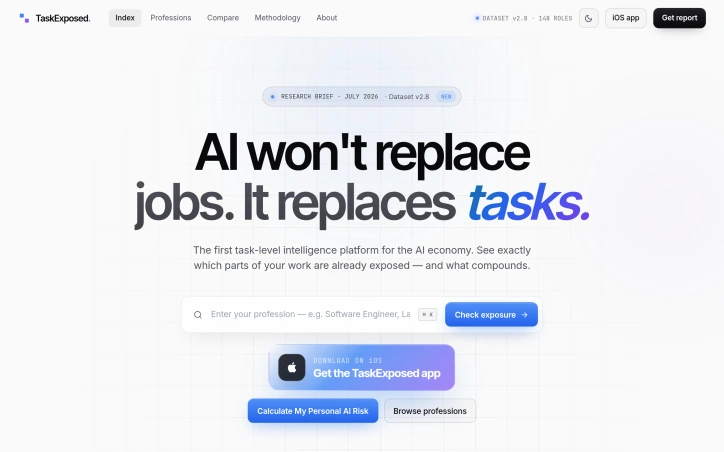
Professionals facing AI-driven workplace change often encounter a credibility gap: broad predictions about job displacement lack the specificity needed for personal career planning. TaskExposed fills this gap by shifting the lens from jobs to tasks, enabling workers across industries to identify which parts of their current role are already addressable by frontier AI models. The platform serves professionals who want concrete insights rather than speculation. Whether you're a software engineer, copywriter, paralegal, or nurse, TaskExposed breaks down your profession into discrete tasks and assigns each an AI exposure rating. The methodology draws from established labor frameworks including O*NET occupational data and Bureau of Labor Statistics employment research, alongside recent work on task-level AI capabilities. This grounding distinguishes the platform from speculative takes on AI's economic impact. The interface presents information at multiple levels of granularity. A task stream shows real-world examples: writing unit tests scores 88 percent exposure while mentoring junior teammates rates just 11 percent. Browsing by profession reveals aggregated patterns. The software engineer role shows 65 percent median exposure with median annual earnings of 132,000 dollars. Paralegals rank at 82 percent exposure, while registered nurses sit at 32 percent, reflecting genuine variation in how AI affects different work domains. Career family groupings allow for cross-cutting analysis, comparing entire fields rather than individual roles. Each role includes not just exposure percentages but also a resilience metric—a signal of which professions retain durable human-critical tasks despite automation pressure. The Computer and Math family shows 67 percent resilience, while Business and Finance drops to 53 percent. These metrics help separate temporary disruption from structural change. An iOS application provides mobile access to these insights, and the platform includes a personal AI risk calculator for individual assessment. The specific percentages and role-level breakdowns suggest investment in occupation-by-occupation analysis rather than blanket pronouncements about AI's impact. The core value proposition remains straightforward: let people understand precisely which parts of their work AI can already address, which remain human-critical, and where the market dynamics are shifting fastest. For professionals considering career moves, employers planning upskilling initiatives, or policymakers weighing workforce interventions, this task-level lens offers more actionable data than aggregate displacement estimates.

User-research
N
Nasko Daskalov

Professionals facing AI-driven workplace change often encounter a credibility gap: broad predictions about job displacement lack the specificity needed for personal career planning. TaskExposed fills this gap by shifting the lens from jobs to tasks, enabling workers across industries to identify which parts of their current role are already addressable by frontier AI models. The platform serves professionals who want concrete insights rather than speculation. Whether you're a software engineer, copywriter, paralegal, or nurse, TaskExposed breaks down your profession into discrete tasks and assigns each an AI exposure rating. The methodology draws from established labor frameworks including O*NET occupational data and Bureau of Labor Statistics employment research, alongside recent work on task-level AI capabilities. This grounding distinguishes the platform from speculative takes on AI's economic impact. The interface presents information at multiple levels of granularity. A task stream shows real-world examples: writing unit tests scores 88 percent exposure while mentoring junior teammates rates just 11 percent. Browsing by profession reveals aggregated patterns. The software engineer role shows 65 percent median exposure with median annual earnings of 132,000 dollars. Paralegals rank at 82 percent exposure, while registered nurses sit at 32 percent, reflecting genuine variation in how AI affects different work domains. Career family groupings allow for cross-cutting analysis, comparing entire fields rather than individual roles. Each role includes not just exposure percentages but also a resilience metric—a signal of which professions retain durable human-critical tasks despite automation pressure. The Computer and Math family shows 67 percent resilience, while Business and Finance drops to 53 percent. These metrics help separate temporary disruption from structural change. An iOS application provides mobile access to these insights, and the platform includes a personal AI risk calculator for individual assessment. The specific percentages and role-level breakdowns suggest investment in occupation-by-occupation analysis rather than blanket pronouncements about AI's impact. The core value proposition remains straightforward: let people understand precisely which parts of their work AI can already address, which remain human-critical, and where the market dynamics are shifting fastest. For professionals considering career moves, employers planning upskilling initiatives, or policymakers weighing workforce interventions, this task-level lens offers more actionable data than aggregate displacement estimates.

Task Exposed preview

Key features

  • Task-Level Ratings: Breaks down professions into discrete tasks with AI exposure percentages.
  • Multi-Level Analysis: Presents information across individual tasks, professions, and career family groupings.
See full listing
Thank Cards

Animated greeting cards address a universal need: sending personalized, memorable messages for life's occasions. Thank Cards positions itself as an accessible solution for anyone who wants to create visually engaging cards without requiring design expertise or technical skills. The product's core offering centers on a library of pre-built animated templates spanning virtually every greeting card occasion. The template catalog ranges from birthday cards with playful themes like cosmic starry designs and cartoon elements to relationship-focused cards for anniversaries, weddings, and confessions. Seasonal options cover holidays from Christmas and Easter to Father's Day and Thanksgiving, with additional categories for friendship, gratitude, and festival celebrations. Each template includes customizable elements, allowing users to personalize their cards while maintaining polished visual results. What distinguishes Thank Cards in a crowded space is the animation layer. Rather than static designs, users create cards with built-in motion graphics, which adds visual interest and emotional resonance. This approach appeals to users seeking to stand out when delivering digital greetings, particularly valuable as physical cards decline and digital alternatives become the default. The barrier to entry is minimal. The platform eliminates design tool complexity that intimidates non-technical users. Instead of manipulating layers and learning design software, users select a template and customize predefined elements. Sharing is integrated directly into the workflow, removing another friction point. The template diversity reflects substantial content investment. The platform supports not just major holidays but granular occasions like monthly birthday greetings and specific relationship milestones. This breadth addresses users who find generic cards unsuitable for their exact situation. The platform operates as a free offering, with no explicit mention of pricing tiers or premium features. This model removes financial friction from trial and adoption, though the underlying monetization strategy remains undisclosed. For individuals and families seeking an alternative to purchased greeting cards, plus anyone wanting to send more personal digital messages without design effort, Thank Cards delivers clear value. The combination of animated templates, customization flexibility, and streamlined sharing addresses the practical need for accessible, modern greeting card alternatives.


Graphic-design-tools
C
chzh wang

Animated greeting cards address a universal need: sending personalized, memorable messages for life's occasions. Thank Cards positions itself as an accessible solution for anyone who wants to create visually engaging cards without requiring design expertise or technical skills. The product's core offering centers on a library of pre-built animated templates spanning virtually every greeting card occasion. The template catalog ranges from birthday cards with playful themes like cosmic starry designs and cartoon elements to relationship-focused cards for anniversaries, weddings, and confessions. Seasonal options cover holidays from Christmas and Easter to Father's Day and Thanksgiving, with additional categories for friendship, gratitude, and festival celebrations. Each template includes customizable elements, allowing users to personalize their cards while maintaining polished visual results. What distinguishes Thank Cards in a crowded space is the animation layer. Rather than static designs, users create cards with built-in motion graphics, which adds visual interest and emotional resonance. This approach appeals to users seeking to stand out when delivering digital greetings, particularly valuable as physical cards decline and digital alternatives become the default. The barrier to entry is minimal. The platform eliminates design tool complexity that intimidates non-technical users. Instead of manipulating layers and learning design software, users select a template and customize predefined elements. Sharing is integrated directly into the workflow, removing another friction point. The template diversity reflects substantial content investment. The platform supports not just major holidays but granular occasions like monthly birthday greetings and specific relationship milestones. This breadth addresses users who find generic cards unsuitable for their exact situation. The platform operates as a free offering, with no explicit mention of pricing tiers or premium features. This model removes financial friction from trial and adoption, though the underlying monetization strategy remains undisclosed. For individuals and families seeking an alternative to purchased greeting cards, plus anyone wanting to send more personal digital messages without design effort, Thank Cards delivers clear value. The combination of animated templates, customization flexibility, and streamlined sharing addresses the practical need for accessible, modern greeting card alternatives.

Thank Cards preview

Key features

  • Animated Templates: Built-in motion graphics add visual interest and emotional resonance to digital greetings.
  • Template Customization: Predefined elements are customizable to personalize cards while maintaining polished results.
See full listing
Soulthread

Most AI chatbots suffer from amnesia. Conversations reset, context vanishes, and users find themselves re-explaining the same details repeatedly. Soulthread tackles this persistent problem by building AI characters designed to retain meaningful information and maintain coherent relationships across extended interactions. The platform targets adults seeking something beyond throwaway chat loops. Rather than brief, contextless exchanges, Soulthread positions itself as a space for deeper AI companionship where continuity matters and characters evolve based on accumulated experiences. What distinguishes Soulthread from generic chatbots is its architectural focus on layered long-term memory. The system doesn't merely log conversation history; instead, it constructs characters with persistent identity traits, emotional complexity, and behavioral consistency. This approach addresses a core frustration with current AI companions: the uncanny sensation of talking to someone who has no real sense of who they are or what you mean to them. The product offers two complementary modes. Story Mode presents curated narratives where users navigate branching scenarios and their decisions carry meaningful consequences. The platform launches with Still Here: Red Long Night, an alternate-history Cold War resistance narrative with a cast of eight characters. Free Chat provides open-ended conversation without narrative structure. Both modes support text and voice interactions, and the system can orchestrate multi-character scenes, adding another layer of complexity beyond single-character dialogue. The community presence reveals engagement beyond the typical chatbot audience. Users share reflective posts that suggest emotional investment in their interactions, hinting at the product's pitch: relationships with characters that recognize and remember them feel qualitatively different from algorithmic small talk. Soulthread also emphasizes world-building as a differentiator. The marketing materials include terminology like Your World with roles for participants, creators, and directors, suggesting users might eventually contribute to or customize narrative spaces. This worldbuilding focus signals ambitions beyond a simple character chat interface. The company does not disclose pricing in available materials. Distribution spans mobile and web platforms, with native applications available through standard app stores and a direct APK option for Android users outside standard distribution channels. Soulthread's value proposition hinges on a reasonable insight: AI relationships deteriorate without context. Whether layered memory systems genuinely solve this problem at scale remains an open question, but the execution suggests a team prioritizing narrative depth and character consistency over conversational breadth.


Dating-apps
W
wei ma

Most AI chatbots suffer from amnesia. Conversations reset, context vanishes, and users find themselves re-explaining the same details repeatedly. Soulthread tackles this persistent problem by building AI characters designed to retain meaningful information and maintain coherent relationships across extended interactions. The platform targets adults seeking something beyond throwaway chat loops. Rather than brief, contextless exchanges, Soulthread positions itself as a space for deeper AI companionship where continuity matters and characters evolve based on accumulated experiences. What distinguishes Soulthread from generic chatbots is its architectural focus on layered long-term memory. The system doesn't merely log conversation history; instead, it constructs characters with persistent identity traits, emotional complexity, and behavioral consistency. This approach addresses a core frustration with current AI companions: the uncanny sensation of talking to someone who has no real sense of who they are or what you mean to them. The product offers two complementary modes. Story Mode presents curated narratives where users navigate branching scenarios and their decisions carry meaningful consequences. The platform launches with Still Here: Red Long Night, an alternate-history Cold War resistance narrative with a cast of eight characters. Free Chat provides open-ended conversation without narrative structure. Both modes support text and voice interactions, and the system can orchestrate multi-character scenes, adding another layer of complexity beyond single-character dialogue. The community presence reveals engagement beyond the typical chatbot audience. Users share reflective posts that suggest emotional investment in their interactions, hinting at the product's pitch: relationships with characters that recognize and remember them feel qualitatively different from algorithmic small talk. Soulthread also emphasizes world-building as a differentiator. The marketing materials include terminology like Your World with roles for participants, creators, and directors, suggesting users might eventually contribute to or customize narrative spaces. This worldbuilding focus signals ambitions beyond a simple character chat interface. The company does not disclose pricing in available materials. Distribution spans mobile and web platforms, with native applications available through standard app stores and a direct APK option for Android users outside standard distribution channels. Soulthread's value proposition hinges on a reasonable insight: AI relationships deteriorate without context. Whether layered memory systems genuinely solve this problem at scale remains an open question, but the execution suggests a team prioritizing narrative depth and character consistency over conversational breadth.

Soulthread preview

Key features

  • Layered Long-Term Memory: The system constructs characters with persistent identity traits, emotional complexity, and behavioral consistency that evolve through interactions.
  • Story Mode: Curated branching narratives where user decisions carry meaningful consequences, launching with an eight-character Cold War alternate-history setting.
See full listing
KPainter

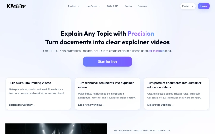
Organizations struggling to communicate complex procedures, technical specifications, and product information face a persistent problem: dense documents fail to engage learners. KPainter addresses this gap by automating the conversion of static source materials into structured video explanations. The platform accepts a broad array of input formats—PDFs, PowerPoint presentations, Word documents, spreadsheets, images, and URLs—then transforms them into videos up to thirty minutes long. Rather than replacing source materials, KPainter uses them as the foundation for visual storytelling, letting creators specify their target audience and desired outcome before the system generates an explainer. This source-led approach distinguishes it from generic animation tools that require starting from scratch. The use cases on display span corporate training, technical communication, and customer education. Teams can turn standard operating procedures into onboarding walkthroughs, convert architecture diagrams and IT runbooks into clear dependencies, and package product guides and release notes into customer-facing videos. The platform also handles data storytelling, animating financial results and engineering specifications into narrative form. Examples shown include explaining rocket design, visualizing blood flow through the heart, and demonstrating how lithography machines work step by step. What stands out is the platform's flexibility around input types and visual complexity. Rather than forcing users to script videos from narrative first principles, KPainter lets them begin with real assets—an existing manual, a company image, an architectural diagram—and translate those into video. The remix capability, allowing users to review and refine generated content, suggests the tool handles the heavy lifting of visual organization while preserving creator control. The pricing model starts with a free tier, though specific plan details and premium features are not disclosed in available materials. This freemium approach lowers the barrier for teams experimenting with video-driven documentation. The platform targets organizations facing a common efficiency problem: knowledge locked in text-heavy formats that don't stick. By automating the creation of structured video explanations from existing materials, KPainter compresses what would otherwise require significant video production effort, scriptwriting, and animation skills.
Ai-generative-media
X
Xinwei

Organizations struggling to communicate complex procedures, technical specifications, and product information face a persistent problem: dense documents fail to engage learners. KPainter addresses this gap by automating the conversion of static source materials into structured video explanations. The platform accepts a broad array of input formats—PDFs, PowerPoint presentations, Word documents, spreadsheets, images, and URLs—then transforms them into videos up to thirty minutes long. Rather than replacing source materials, KPainter uses them as the foundation for visual storytelling, letting creators specify their target audience and desired outcome before the system generates an explainer. This source-led approach distinguishes it from generic animation tools that require starting from scratch. The use cases on display span corporate training, technical communication, and customer education. Teams can turn standard operating procedures into onboarding walkthroughs, convert architecture diagrams and IT runbooks into clear dependencies, and package product guides and release notes into customer-facing videos. The platform also handles data storytelling, animating financial results and engineering specifications into narrative form. Examples shown include explaining rocket design, visualizing blood flow through the heart, and demonstrating how lithography machines work step by step. What stands out is the platform's flexibility around input types and visual complexity. Rather than forcing users to script videos from narrative first principles, KPainter lets them begin with real assets—an existing manual, a company image, an architectural diagram—and translate those into video. The remix capability, allowing users to review and refine generated content, suggests the tool handles the heavy lifting of visual organization while preserving creator control. The pricing model starts with a free tier, though specific plan details and premium features are not disclosed in available materials. This freemium approach lowers the barrier for teams experimenting with video-driven documentation. The platform targets organizations facing a common efficiency problem: knowledge locked in text-heavy formats that don't stick. By automating the creation of structured video explanations from existing materials, KPainter compresses what would otherwise require significant video production effort, scriptwriting, and animation skills.

KPainter preview

Key features

  • Multi-Format Input: Accepts PDFs, PowerPoint presentations, Word documents, spreadsheets, images, and URLs.
  • Video Generation: Transforms source materials into structured video explanations up to thirty minutes long.
See full listing
KyttoMCP

Managing multiple Model Context Protocol servers across different AI coding tools creates a fragmented configuration nightmare. Developers end up with scattered settings across JSON and TOML files, unable to see the complete picture of what's active where. KyttoMCP directly addresses this coordination problem with a focused control panel designed around the specific workflows of teams using Claude, Cursor, VS Code, and other compatible clients. The product's core strength is its unified matrix view. Rather than hunting through configuration files, users can see at a glance which MCP servers are enabled across each client and toggle them from one interface. This single source of truth eliminates the most immediate friction point in managing multi-server setups. Beyond visibility, KyttoMCP includes practical operational safeguards. It estimates the context window cost of each server's tool definitions, letting users optimize their configuration without accidentally bloating context usage. Before any configuration change, the tool creates timestamped backups. Changes themselves are written atomically, preventing the corrupted or truncated files that plague JSON editing. These design choices reflect a philosophy of "built for trust"—the application prioritizes data safety and user confidence over aggressive feature expansion. The local-first architecture reinforces this positioning. Configuration files remain on the user's computer; there's no cloud account, no sync service, no third-party intermediary between the user and their settings. This stands out against the industry trend toward cloud-hosted management tools and appeals directly to users who value control and privacy. The pricing model is equally straightforward. KyttoMCP is free throughout its beta phase with no account required. Installation is platform-specific: a DMG file for macOS and a Windows installer, with documented launch procedures including handling for unsigned-developer warnings. The product targets a specific segment: developers and teams managing MCP complexity across multiple tools. It doesn't attempt to abstract away MCP servers themselves or add entirely new functionality. Instead, it solves a genuine coordination problem that emerges as MCP adoption grows. For teams already juggling multiple AI clients and MCP server configurations, KyttoMCP eliminates a category of repetitive maintenance work. Its strength lies in this focused scope and its commitment to safety and transparency.
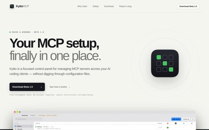

Automation-tools
J
Jakub Hecht

Managing multiple Model Context Protocol servers across different AI coding tools creates a fragmented configuration nightmare. Developers end up with scattered settings across JSON and TOML files, unable to see the complete picture of what's active where. KyttoMCP directly addresses this coordination problem with a focused control panel designed around the specific workflows of teams using Claude, Cursor, VS Code, and other compatible clients. The product's core strength is its unified matrix view. Rather than hunting through configuration files, users can see at a glance which MCP servers are enabled across each client and toggle them from one interface. This single source of truth eliminates the most immediate friction point in managing multi-server setups. Beyond visibility, KyttoMCP includes practical operational safeguards. It estimates the context window cost of each server's tool definitions, letting users optimize their configuration without accidentally bloating context usage. Before any configuration change, the tool creates timestamped backups. Changes themselves are written atomically, preventing the corrupted or truncated files that plague JSON editing. These design choices reflect a philosophy of "built for trust"—the application prioritizes data safety and user confidence over aggressive feature expansion. The local-first architecture reinforces this positioning. Configuration files remain on the user's computer; there's no cloud account, no sync service, no third-party intermediary between the user and their settings. This stands out against the industry trend toward cloud-hosted management tools and appeals directly to users who value control and privacy. The pricing model is equally straightforward. KyttoMCP is free throughout its beta phase with no account required. Installation is platform-specific: a DMG file for macOS and a Windows installer, with documented launch procedures including handling for unsigned-developer warnings. The product targets a specific segment: developers and teams managing MCP complexity across multiple tools. It doesn't attempt to abstract away MCP servers themselves or add entirely new functionality. Instead, it solves a genuine coordination problem that emerges as MCP adoption grows. For teams already juggling multiple AI clients and MCP server configurations, KyttoMCP eliminates a category of repetitive maintenance work. Its strength lies in this focused scope and its commitment to safety and transparency.

KyttoMCP preview

Key features

  • Unified Matrix View: See at a glance which MCP servers are enabled across each client and toggle them from one interface
  • Context Window Optimizer: Estimates the context window cost of each server's tool definitions to help optimize configuration
See full listing
OpticAlpha

Consolidating market data into a single dashboard has long been a pain point for active traders juggling multiple subscriptions and browser tabs. OpticAlpha tackles this fragmentation by bundling options flow analysis, gamma exposure tracking, cryptocurrency liquidation monitoring, and macroeconomic indicators into one workspace at $10.50 per month. The product targets a specific niche: traders who need real-time insight across options, crypto, foreign exchange, and macro markets without the friction of platform switching. The company positions itself not as a comprehensive all-in-one terminal but as a specialized consolidation layer that pulls the most actionable signals into a unified interface. Several design choices stand out. The options flow module surfaces unusual option prints filtered by size and premium, then ranks tickers by actual flow activity rather than raw volume—a meaningful distinction for traders separating signal from noise. The gamma exposure section maps call and put walls and flags where dealer hedging becomes forced, a feature appealing to volatility traders. On the crypto side, liquidation heatmaps overlay exchange-level leverage data alongside BTC and ETH pricing, with whale alert notifications for large prints. Features extend beyond directional trading. The forex module includes CFTC Commitment of Traders data and a correlation matrix updating weekly, letting traders spot crowded positioning before reversals. Macro traders get a one-minute refresh on the full US Treasury curve plus eighteen FRED economic indicators covering growth, inflation, employment and rates. An analyst ratings feed streams upgrades and downgrades with price-target moves attached. For equities, a Conviction Radar surfaces tickers only after multiple independent signals align. The pricing model is straightforward: a 14-day trial followed by $10.50 monthly. The company claims 12+ live channels and 25+ data streams refresh in real time using the same feeds that power institutional terminals rather than delayed data. The core value proposition rests on consolidation and signal filtering rather than raw feature count. For traders constantly tab-switching between specialized tools, the unified workspace and cross-asset correlation features address a genuine workflow pain. Whether execution delivers on that promise requires hands-on testing, but the product's opinionated feature set and direct pricing point to a focused roadmap.
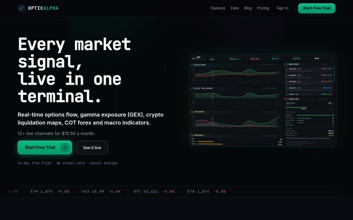

Stock-trading-platforms
O
OpticAlpha 870

Consolidating market data into a single dashboard has long been a pain point for active traders juggling multiple subscriptions and browser tabs. OpticAlpha tackles this fragmentation by bundling options flow analysis, gamma exposure tracking, cryptocurrency liquidation monitoring, and macroeconomic indicators into one workspace at $10.50 per month. The product targets a specific niche: traders who need real-time insight across options, crypto, foreign exchange, and macro markets without the friction of platform switching. The company positions itself not as a comprehensive all-in-one terminal but as a specialized consolidation layer that pulls the most actionable signals into a unified interface. Several design choices stand out. The options flow module surfaces unusual option prints filtered by size and premium, then ranks tickers by actual flow activity rather than raw volume—a meaningful distinction for traders separating signal from noise. The gamma exposure section maps call and put walls and flags where dealer hedging becomes forced, a feature appealing to volatility traders. On the crypto side, liquidation heatmaps overlay exchange-level leverage data alongside BTC and ETH pricing, with whale alert notifications for large prints. Features extend beyond directional trading. The forex module includes CFTC Commitment of Traders data and a correlation matrix updating weekly, letting traders spot crowded positioning before reversals. Macro traders get a one-minute refresh on the full US Treasury curve plus eighteen FRED economic indicators covering growth, inflation, employment and rates. An analyst ratings feed streams upgrades and downgrades with price-target moves attached. For equities, a Conviction Radar surfaces tickers only after multiple independent signals align. The pricing model is straightforward: a 14-day trial followed by $10.50 monthly. The company claims 12+ live channels and 25+ data streams refresh in real time using the same feeds that power institutional terminals rather than delayed data. The core value proposition rests on consolidation and signal filtering rather than raw feature count. For traders constantly tab-switching between specialized tools, the unified workspace and cross-asset correlation features address a genuine workflow pain. Whether execution delivers on that promise requires hands-on testing, but the product's opinionated feature set and direct pricing point to a focused roadmap.

OpticAlpha preview

Key features

  • Options Flow Analysis: Surfaces unusual option prints filtered by size and premium, ranked by actual flow activity.
  • Gamma Exposure Tracking: Maps call and put walls and flags forced dealer hedging for volatility traders.
See full listing
Ai Color Analysis

Finding your ideal wardrobe colors has historically required professional consultants or tedious trial-and-error shopping. This browser-based color analysis tool addresses that friction by delivering seasonal color profiling in about ten seconds, making professional color advice instantly accessible to anyone with a smartphone or computer. The tool works by analyzing a photo of your face to determine skin tone and undertone, then matching you to one of twelve seasonal color profiles rather than the traditional four-season system. From there, it integrates with major retail partners including Amazon, ASOS, and H&M to show which pieces in their inventory match your palette before you purchase. Beyond wardrobe recommendations, the platform includes a 3D virtual try-on feature for eyeglasses and a product color testing mode that lets users photograph clothing items to verify whether specific colors harmonize with their profile. What distinguishes this approach is its architecture and privacy stance. The entire analysis runs inside your browser rather than uploading images to company servers. The founder explicitly positions this as central to the value proposition: photos are never transmitted, stored, or analyzed on external infrastructure. This addresses a growing consumer concern around facial data handling and appeals to privacy-conscious users who might otherwise hesitate to upload selfies. The feature set suggests ambitions beyond a one-time color analysis tool. The integration with retail discovery, the 3D glasses fitting, and the ability to test specific products indicate a vision toward becoming a continuous shopping companion rather than a standalone consultant replacement. The inclusion of child and men-specific profiles broadens its addressable market beyond the traditionally female-dominated color analysis space. The tool leans on AI for the actual color matching analysis but doesn't oversell the technology. The twelve-season system appears to be a known framework from fashion theory rather than a novel classification system. The product acknowledges its limitations, noting that the glasses try-on feature is still in development and that photos shot in optimal lighting produce better results. There is no pricing information disclosed on the site, leaving the business model unclear. Whether this operates as a free tool, a freemium model with premium features, or a revenue driver through retail partner referrals remains ambiguous. For a startup seeking sustainable growth and investor confidence, clarity on monetization would strengthen its market positioning.
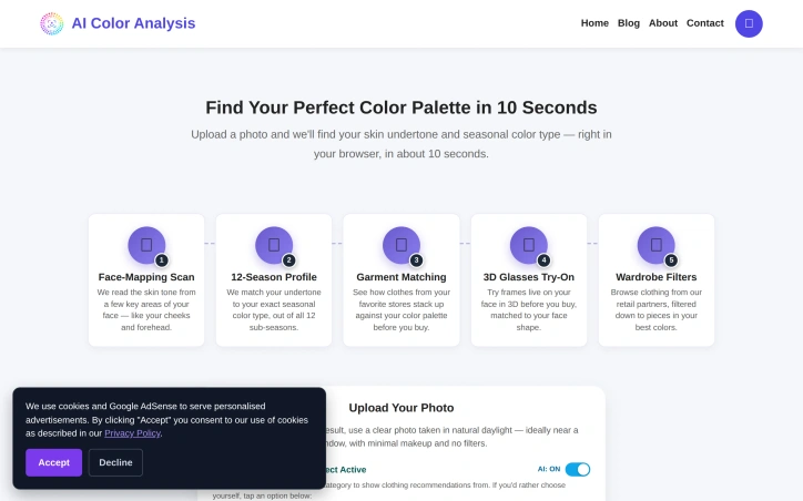

Finding your ideal wardrobe colors has historically required professional consultants or tedious trial-and-error shopping. This browser-based color analysis tool addresses that friction by delivering seasonal color profiling in about ten seconds, making professional color advice instantly accessible to anyone with a smartphone or computer. The tool works by analyzing a photo of your face to determine skin tone and undertone, then matching you to one of twelve seasonal color profiles rather than the traditional four-season system. From there, it integrates with major retail partners including Amazon, ASOS, and H&M to show which pieces in their inventory match your palette before you purchase. Beyond wardrobe recommendations, the platform includes a 3D virtual try-on feature for eyeglasses and a product color testing mode that lets users photograph clothing items to verify whether specific colors harmonize with their profile. What distinguishes this approach is its architecture and privacy stance. The entire analysis runs inside your browser rather than uploading images to company servers. The founder explicitly positions this as central to the value proposition: photos are never transmitted, stored, or analyzed on external infrastructure. This addresses a growing consumer concern around facial data handling and appeals to privacy-conscious users who might otherwise hesitate to upload selfies. The feature set suggests ambitions beyond a one-time color analysis tool. The integration with retail discovery, the 3D glasses fitting, and the ability to test specific products indicate a vision toward becoming a continuous shopping companion rather than a standalone consultant replacement. The inclusion of child and men-specific profiles broadens its addressable market beyond the traditionally female-dominated color analysis space. The tool leans on AI for the actual color matching analysis but doesn't oversell the technology. The twelve-season system appears to be a known framework from fashion theory rather than a novel classification system. The product acknowledges its limitations, noting that the glasses try-on feature is still in development and that photos shot in optimal lighting produce better results. There is no pricing information disclosed on the site, leaving the business model unclear. Whether this operates as a free tool, a freemium model with premium features, or a revenue driver through retail partner referrals remains ambiguous. For a startup seeking sustainable growth and investor confidence, clarity on monetization would strengthen its market positioning.

Ai Color Analysis  preview

Key features

  • Seasonal Color Profiling: Analyzes your face to determine skin tone and matches you to one of twelve seasonal color profiles in about ten seconds.
  • Private Analysis: Entire analysis runs in your browser with photos never uploaded or stored on external servers.
See full listing
Vakta

Space enthusiasts have long fragmented their attention across multiple websites and apps to track rocket launches, monitor the International Space Station, and stay current on space industry developments. Vakta consolidates these interests into a unified platform that serves both casual stargazers and professionals engaged in the space economy. The core offering centers on real-time data presented in an accessible format. A live launch manifest displays upcoming orbital launches worldwide with times automatically adjusted to the user's local timezone, addressing the perennial frustration of timezone conversions. The ISS tracker provides continuous position updates refreshing every five seconds, showing current altitude, velocity, and crew aboard, along with the ability to locate the station's next visible pass from a given location. Space weather monitoring pulls live data from NOAA's Space Weather Prediction Center, displaying solar wind speeds, aurora forecasts via the Kp Index, and current solar flare activity. What distinguishes Vakta beyond raw data feeds is its editorial integration. The platform aggregates breaking space news from leading spaceflight newsrooms in a continuously updated feed, and features a launch leaderboard tracking success rates and mission counts among competing providers. A calendar of major astronomical events helps users plan observing sessions, while an "Ask Vakta" Q&A feature positions the platform as an interactive information source rather than a passive dashboard. The platform extends beyond data to commerce, offering curated space-themed merchandise through an affiliated storefront. As an Amazon Associate and eBay Partner, Vakta earns commissions from qualifying purchases while directing profits back to platform development. The inclusion of space industry job listings points toward additional value capture by serving as a hub for recruitment within the aerospace sector. The design philosophy prioritizes live data and urgency. Nearly every interface element emphasizes real-time updates—solar data refreshing every five minutes, launch times localized to users' timezones, ISS position live-updated by the second. This approach resonates with an audience that views space as an unfolding story rather than static reference material. Vakta addresses a genuine gap for space-interested users who currently juggle multiple specialized services. By positioning itself as the unified entry point for launches, real-time space weather, news, and community around commercial spaceflight, it creates a compelling destination for an audience with genuine enthusiasm and recurring engagement patterns.
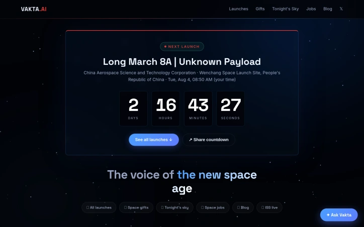
Space enthusiasts have long fragmented their attention across multiple websites and apps to track rocket launches, monitor the International Space Station, and stay current on space industry developments. Vakta consolidates these interests into a unified platform that serves both casual stargazers and professionals engaged in the space economy. The core offering centers on real-time data presented in an accessible format. A live launch manifest displays upcoming orbital launches worldwide with times automatically adjusted to the user's local timezone, addressing the perennial frustration of timezone conversions. The ISS tracker provides continuous position updates refreshing every five seconds, showing current altitude, velocity, and crew aboard, along with the ability to locate the station's next visible pass from a given location. Space weather monitoring pulls live data from NOAA's Space Weather Prediction Center, displaying solar wind speeds, aurora forecasts via the Kp Index, and current solar flare activity. What distinguishes Vakta beyond raw data feeds is its editorial integration. The platform aggregates breaking space news from leading spaceflight newsrooms in a continuously updated feed, and features a launch leaderboard tracking success rates and mission counts among competing providers. A calendar of major astronomical events helps users plan observing sessions, while an "Ask Vakta" Q&A feature positions the platform as an interactive information source rather than a passive dashboard. The platform extends beyond data to commerce, offering curated space-themed merchandise through an affiliated storefront. As an Amazon Associate and eBay Partner, Vakta earns commissions from qualifying purchases while directing profits back to platform development. The inclusion of space industry job listings points toward additional value capture by serving as a hub for recruitment within the aerospace sector. The design philosophy prioritizes live data and urgency. Nearly every interface element emphasizes real-time updates—solar data refreshing every five minutes, launch times localized to users' timezones, ISS position live-updated by the second. This approach resonates with an audience that views space as an unfolding story rather than static reference material. Vakta addresses a genuine gap for space-interested users who currently juggle multiple specialized services. By positioning itself as the unified entry point for launches, real-time space weather, news, and community around commercial spaceflight, it creates a compelling destination for an audience with genuine enthusiasm and recurring engagement patterns.

Vakta preview

Key features

  • Live Launch Manifest: Displays upcoming orbital launches worldwide with automatic timezone adjustment to the user's location.
  • ISS Position Tracker: Provides continuous position updates every five seconds showing altitude, velocity, crew aboard, and next visible pass predictions.
See full listing
Syllable Counter

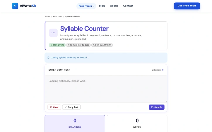
Poetry and language instruction share a common friction point: the tedious, error-prone work of counting syllables by hand. Whether a student is drafting a haiku, a teacher constructing readability-checked lesson materials, or a language learner parsing the phonetic structure of unfamiliar words, syllable counting interrupts the creative or instructional workflow. This free, account-free tool addresses that gap directly, offering instantaneous syllable counts across single words, full passages, or structured verse without requiring registration or payment. The product pairs a rule-based algorithm with a syllable dictionary, a deliberately hybrid approach that acknowledges a real linguistic problem: English orthography and pronunciation diverge sharply. Words like "comfortable" compress in natural speech; "poem" splits differently than its letters imply. By combining both methods rather than relying on pattern-matching alone, the tool targets reliability across standard vocabulary. The architecture is transparent about its constraints as well, noting that dialects, loanwords, and proper nouns may fall outside consistent coverage. That honesty distinguishes it from tools claiming universal accuracy. The interface centers on per-line syllable counts, a feature the maker emphasizes as structural rather than decorative. For poets working in meter-dependent forms, this granularity is not incidental; one syllable out of place in a stanza breaks the rhythm. The tool displays per-word syllable breakdowns inline as users type, allowing real-time feedback without submission delays. It also surfaces word and line counts, useful context for both poetic form verification and readability assessment. The target audience is broad: poets across formal verse traditions, students building English fluency, educators designing accessible materials, and content creators checking Flesch-Kincaid and similar readability formulas that hinge on syllable density. The makers position syllable counting as foundational for pronunciation intuition and grammar sense in language acquisition, a reasonable pedagogical claim. Practically, the tool operates without friction. No sign-up, no storage of user text, no watermarks, and no cost remove friction from a frequent task. The interface is lean enough to load instantly and stay responsive. For academic or publishing contexts where formal precision matters, the makers wisely suggest cross-checking against phonetic references. For everyday writing, learning, and poetry composition, the output is positioned as reliable enough to use directly. The result is a focused, no-nonsense utility that solves a specific problem well and acknowledges its limits candidly.

Productivity
A
abdullah pro

Poetry and language instruction share a common friction point: the tedious, error-prone work of counting syllables by hand. Whether a student is drafting a haiku, a teacher constructing readability-checked lesson materials, or a language learner parsing the phonetic structure of unfamiliar words, syllable counting interrupts the creative or instructional workflow. This free, account-free tool addresses that gap directly, offering instantaneous syllable counts across single words, full passages, or structured verse without requiring registration or payment. The product pairs a rule-based algorithm with a syllable dictionary, a deliberately hybrid approach that acknowledges a real linguistic problem: English orthography and pronunciation diverge sharply. Words like "comfortable" compress in natural speech; "poem" splits differently than its letters imply. By combining both methods rather than relying on pattern-matching alone, the tool targets reliability across standard vocabulary. The architecture is transparent about its constraints as well, noting that dialects, loanwords, and proper nouns may fall outside consistent coverage. That honesty distinguishes it from tools claiming universal accuracy. The interface centers on per-line syllable counts, a feature the maker emphasizes as structural rather than decorative. For poets working in meter-dependent forms, this granularity is not incidental; one syllable out of place in a stanza breaks the rhythm. The tool displays per-word syllable breakdowns inline as users type, allowing real-time feedback without submission delays. It also surfaces word and line counts, useful context for both poetic form verification and readability assessment. The target audience is broad: poets across formal verse traditions, students building English fluency, educators designing accessible materials, and content creators checking Flesch-Kincaid and similar readability formulas that hinge on syllable density. The makers position syllable counting as foundational for pronunciation intuition and grammar sense in language acquisition, a reasonable pedagogical claim. Practically, the tool operates without friction. No sign-up, no storage of user text, no watermarks, and no cost remove friction from a frequent task. The interface is lean enough to load instantly and stay responsive. For academic or publishing contexts where formal precision matters, the makers wisely suggest cross-checking against phonetic references. For everyday writing, learning, and poetry composition, the output is positioned as reliable enough to use directly. The result is a focused, no-nonsense utility that solves a specific problem well and acknowledges its limits candidly.

Syllable Counter preview

Key features

  • Hybrid Syllable Algorithm: Combines rule-based patterns with syllable dictionary to handle English's divergent orthography and pronunciation
  • Real-Time Feedback: Displays per-word syllable breakdowns inline as users type without submission delays
See full listing
careersim.ai

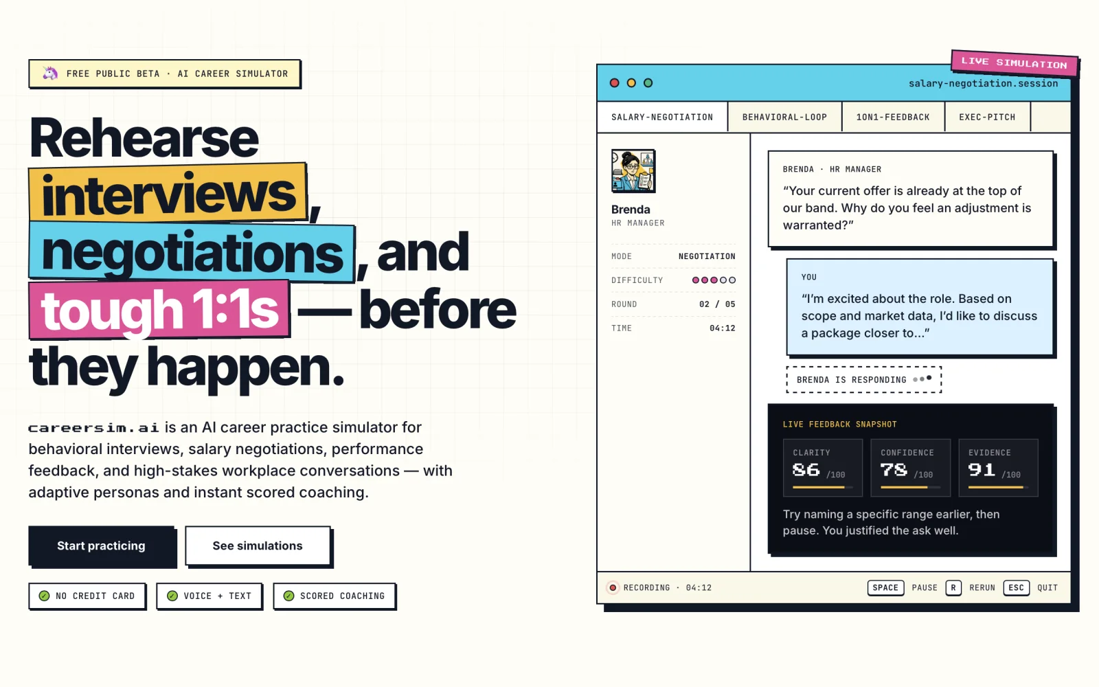
Professionals preparing for high-stakes conversations now have a low-risk environment to build competency. This AI-powered simulation platform targets three common career challenges: behavioral interview preparation, negotiation strategy, and difficult workplace dialogue. Users engage with customizable AI personas that present varied communication styles and hidden objectives, creating scenarios that feel closer to reality than rote practice. The dual interface—text and voice—accommodates different learning preferences and helps users practice oral delivery for situations where tone and pacing matter. Immediate feedback on emotional recognition and goal attainment provides actionable insights on the fly rather than vague reinforcement. The approach addresses a real gap. Many professionals lack safe spaces to stumble through these conversations before stakes rise, and live coaching can feel expensive or intimidating. By positioning practice as judgment-free repetition against software opponents, the platform removes social friction while building actual fluency. The value hinges on scenario quality and AI responsiveness. Personas must feel authentically reactive rather than scripted, and feedback must be specific enough to inform better choices next round. Success also depends on whether users actually internalize lessons from practice or simply chase scores. For career-conscious professionals who want to rehearse rather than improvise, this fills a practical niche.

Ai-characters
P
Pavel Vdovenko

Professionals preparing for high-stakes conversations now have a low-risk environment to build competency. This AI-powered simulation platform targets three common career challenges: behavioral interview preparation, negotiation strategy, and difficult workplace dialogue. Users engage with customizable AI personas that present varied communication styles and hidden objectives, creating scenarios that feel closer to reality than rote practice. The dual interface—text and voice—accommodates different learning preferences and helps users practice oral delivery for situations where tone and pacing matter. Immediate feedback on emotional recognition and goal attainment provides actionable insights on the fly rather than vague reinforcement. The approach addresses a real gap. Many professionals lack safe spaces to stumble through these conversations before stakes rise, and live coaching can feel expensive or intimidating. By positioning practice as judgment-free repetition against software opponents, the platform removes social friction while building actual fluency. The value hinges on scenario quality and AI responsiveness. Personas must feel authentically reactive rather than scripted, and feedback must be specific enough to inform better choices next round. Success also depends on whether users actually internalize lessons from practice or simply chase scores. For career-conscious professionals who want to rehearse rather than improvise, this fills a practical niche.

careersim.ai preview

Key features

  • AI Personas: Customizable AI characters with varied communication styles and hidden objectives that create realistic practice scenarios.
  • Dual Interface: Text and voice options to accommodate different learning preferences and enable practice for tone and pacing.
See full listing
UnixTime

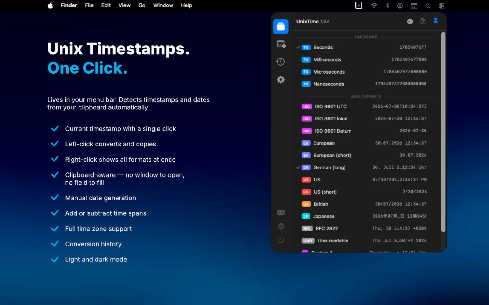
Developers working with Unix timestamps face a recurring friction: converting between epoch time and human-readable dates typically requires opening a browser, finding a converter, and pasting back and forth. UnixTime, a native macOS menu bar app, eliminates this workflow entirely by placing timestamp conversion directly where developers already spend their attention—in the menu bar. The core interaction is immediate. Hover over the menu bar icon to see what's on your clipboard, its conversion counterpart, and what a single click will copy, all before committing to the action. Click left to perform a conversion or copy the current timestamp if the clipboard is empty. Right-click to see all available output formats at once, customizable through drag-and-drop to show only what matters. The app operates completely offline, never transmitting data outside the local machine. What distinguishes UnixTime is its comprehensive format support. Beyond the standard Unix seconds and milliseconds, it handles microseconds, nanoseconds, and platform-specific formats used by .NET, Windows, Chrome, WebKit, Mozilla, Apple, and legacy Macintosh systems. It even converts astronomical Julian Day Numbers. Timestamps appear with their units labeled, eliminating ambiguity about scale. A built-in date and time calculator moves beyond simple conversions. Users can construct specific moments by entering dates, adjusting values by seconds through years, switching time zones, or generating random dates for testing purposes. Every conversion gets logged in a searchable history tied to the source application, so previously converted values can be retrieved and recopied without re-entering data. Customization is thorough. Users control which formats appear and in what order, set preferred defaults for timestamp and date output, and create unlimited custom date formats with unique names and patterns. The app respects macOS appearance settings, automatically following light and dark modes or locked to either. Localization spans 12 languages, and the business model is straightforward: a 2.99 euro one-time purchase with no subscription, advertisements, or data collection. The result is an app built directly for how developers actually work—minimizing context switching and reducing unnecessary steps in a task they perform hundreds of times.

Data-analysis-tools
L
Labor 77

Developers working with Unix timestamps face a recurring friction: converting between epoch time and human-readable dates typically requires opening a browser, finding a converter, and pasting back and forth. UnixTime, a native macOS menu bar app, eliminates this workflow entirely by placing timestamp conversion directly where developers already spend their attention—in the menu bar. The core interaction is immediate. Hover over the menu bar icon to see what's on your clipboard, its conversion counterpart, and what a single click will copy, all before committing to the action. Click left to perform a conversion or copy the current timestamp if the clipboard is empty. Right-click to see all available output formats at once, customizable through drag-and-drop to show only what matters. The app operates completely offline, never transmitting data outside the local machine. What distinguishes UnixTime is its comprehensive format support. Beyond the standard Unix seconds and milliseconds, it handles microseconds, nanoseconds, and platform-specific formats used by .NET, Windows, Chrome, WebKit, Mozilla, Apple, and legacy Macintosh systems. It even converts astronomical Julian Day Numbers. Timestamps appear with their units labeled, eliminating ambiguity about scale. A built-in date and time calculator moves beyond simple conversions. Users can construct specific moments by entering dates, adjusting values by seconds through years, switching time zones, or generating random dates for testing purposes. Every conversion gets logged in a searchable history tied to the source application, so previously converted values can be retrieved and recopied without re-entering data. Customization is thorough. Users control which formats appear and in what order, set preferred defaults for timestamp and date output, and create unlimited custom date formats with unique names and patterns. The app respects macOS appearance settings, automatically following light and dark modes or locked to either. Localization spans 12 languages, and the business model is straightforward: a 2.99 euro one-time purchase with no subscription, advertisements, or data collection. The result is an app built directly for how developers actually work—minimizing context switching and reducing unnecessary steps in a task they perform hundreds of times.

UnixTime preview

Key features

  • Menu Bar Integration: Timestamp conversion directly accessible from the macOS menu bar
  • Instant Preview: Hover to see clipboard content, conversion counterpart, and what will be copied before acting
See full listing
Sidenote

Hallucinating AI summaries plague the current generation of document tools, where plausible-sounding claims bypass verification until the reader discovers they were never in the source material. Sidenote tackles this through a forced citation model: every answer the AI generates must quote directly from the document being analyzed, and the server validates each citation against the actual retrieved text. Wrong claims get dropped. Citations become clickable, scrolling the document to highlight the exact passage. This transforms summarization from something requiring skeptical re-reading into a tool that actually compresses reading time. The product works as a browser extension across Chrome, Edge, and Firefox, sitting in a side panel next to whatever document the user is reading. It handles the document ecosystem comprehensively: Confluence pages, PDFs with OCR support, Google Docs, Notion, SharePoint, GitHub READMEs, arXiv papers, Slack canvases, and generic web articles. The core features cover typical summarization needs: text summaries, chat interfaces, explanations, glossary generation, and semantic search within documents. Users can highlight passages, attach notes, export outputs as Markdown, HTML, or PDF, and organize their document library with tags and starred collections. The product positions itself for internal knowledge work first, targeting users who spend time with runbooks, specifications, wikis, and technical documentation where accuracy matters more than polish. This focus is reflected in the data architecture: embeddings live in a UK region with row-level security policies isolating documents per user account. Users choose between two retention modes for each document. Store mode keeps documents indexed for the account lifetime, while Discard purges everything within 24 hours. The commitment to data privacy is explicit: documents are never used to train models. What distinguishes Sidenote is its acceptance of friction as a feature. The citation requirement means summaries trade some fluency for verifiability, a calculation that resolves a real reliability problem other summarization tools avoid through opacity. The product launches free, remains a solo project built in the UK, and emphasizes shipped features over roadmap promises. For document-heavy work where verification time often exceeds reading time, this tradeoff addresses a genuine gap in the current landscape.


Chrome-extensions
L
Lewis Hadden

Hallucinating AI summaries plague the current generation of document tools, where plausible-sounding claims bypass verification until the reader discovers they were never in the source material. Sidenote tackles this through a forced citation model: every answer the AI generates must quote directly from the document being analyzed, and the server validates each citation against the actual retrieved text. Wrong claims get dropped. Citations become clickable, scrolling the document to highlight the exact passage. This transforms summarization from something requiring skeptical re-reading into a tool that actually compresses reading time. The product works as a browser extension across Chrome, Edge, and Firefox, sitting in a side panel next to whatever document the user is reading. It handles the document ecosystem comprehensively: Confluence pages, PDFs with OCR support, Google Docs, Notion, SharePoint, GitHub READMEs, arXiv papers, Slack canvases, and generic web articles. The core features cover typical summarization needs: text summaries, chat interfaces, explanations, glossary generation, and semantic search within documents. Users can highlight passages, attach notes, export outputs as Markdown, HTML, or PDF, and organize their document library with tags and starred collections. The product positions itself for internal knowledge work first, targeting users who spend time with runbooks, specifications, wikis, and technical documentation where accuracy matters more than polish. This focus is reflected in the data architecture: embeddings live in a UK region with row-level security policies isolating documents per user account. Users choose between two retention modes for each document. Store mode keeps documents indexed for the account lifetime, while Discard purges everything within 24 hours. The commitment to data privacy is explicit: documents are never used to train models. What distinguishes Sidenote is its acceptance of friction as a feature. The citation requirement means summaries trade some fluency for verifiability, a calculation that resolves a real reliability problem other summarization tools avoid through opacity. The product launches free, remains a solo project built in the UK, and emphasizes shipped features over roadmap promises. For document-heavy work where verification time often exceeds reading time, this tradeoff addresses a genuine gap in the current landscape.

Sidenote preview

Key features

  • Forced Citations: Every AI answer must quote directly from the source document, preventing hallucinated claims.
  • Citation Validation: The server validates each citation against actual retrieved text and drops incorrect claims.
See full listing
Anyvids

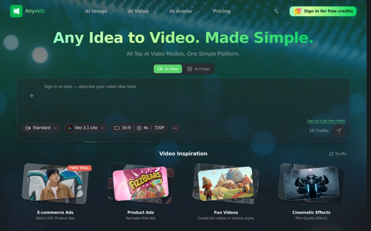
Consolidating multiple AI creative tools into a single platform addresses a genuine friction point for content creators. This service brings together various video and image generation models under one roof, eliminating the context-switching that plagues creative workflows. The platform's value proposition centers on three practical problems: navigating between specialized tools, choosing among competing models, and understanding true costs. By housing multiple top-tier generation capabilities—from text-to-video synthesis to character animation and avatar creation—users can move through their entire creative pipeline without frequent tool-switching. What distinguishes this offering is its commitment to pricing clarity. Rather than hiding generation costs behind opaque tier structures, the platform displays credit expenditure per operation, maintains searchable usage history, and explicitly outlines refund policies. The entry-level subscription removes watermarks and grants commercial usage rights, features typically reserved for premium tiers elsewhere. The integrated editing environment allows for prompt-based refinements, character swapping, and upscaling without exporting to separate applications. This architectural choice substantially reduces friction in iterative creative work. For creators juggling multiple subscriptions and platform APIs, the consolidation offers both cognitive simplification and cost transparency. Whether this efficiency gain justifies yet another subscription depends on existing tool usage patterns and budget constraints, but the platform appears thoughtfully designed around actual creator pain points rather than artificial feature bundling.

Advertising-tools
D
daniel

Consolidating multiple AI creative tools into a single platform addresses a genuine friction point for content creators. This service brings together various video and image generation models under one roof, eliminating the context-switching that plagues creative workflows. The platform's value proposition centers on three practical problems: navigating between specialized tools, choosing among competing models, and understanding true costs. By housing multiple top-tier generation capabilities—from text-to-video synthesis to character animation and avatar creation—users can move through their entire creative pipeline without frequent tool-switching. What distinguishes this offering is its commitment to pricing clarity. Rather than hiding generation costs behind opaque tier structures, the platform displays credit expenditure per operation, maintains searchable usage history, and explicitly outlines refund policies. The entry-level subscription removes watermarks and grants commercial usage rights, features typically reserved for premium tiers elsewhere. The integrated editing environment allows for prompt-based refinements, character swapping, and upscaling without exporting to separate applications. This architectural choice substantially reduces friction in iterative creative work. For creators juggling multiple subscriptions and platform APIs, the consolidation offers both cognitive simplification and cost transparency. Whether this efficiency gain justifies yet another subscription depends on existing tool usage patterns and budget constraints, but the platform appears thoughtfully designed around actual creator pain points rather than artificial feature bundling.

Anyvids preview

Key features

  • Multi-Model Consolidation: Houses multiple top-tier AI generation capabilities from text-to-video synthesis to character animation in one platform
  • Cost Transparency: Displays credit expenditure per operation and maintains searchable usage history
See full listing
Yooiu

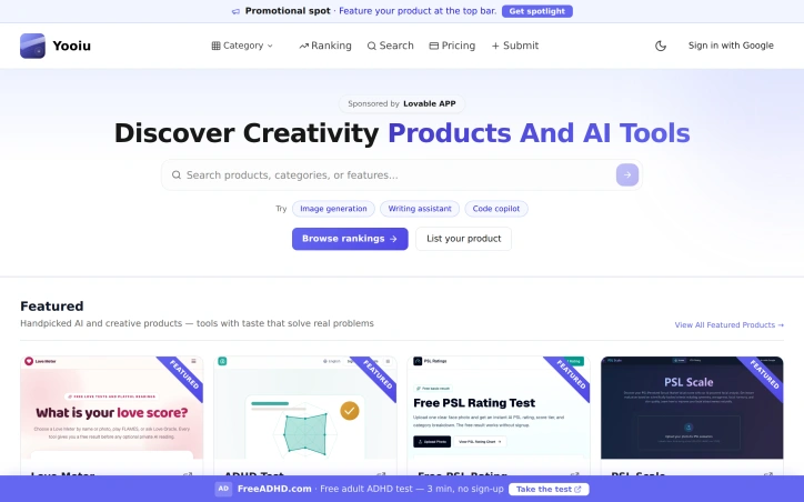
Cutting through the overwhelming selection of AI and creative tools requires more than a search engine. Yooiu tackles this problem head-on as a curated directory designed specifically for creators and developers who need to evaluate and adopt new products quickly. Rather than surfacing everything the internet has to offer, the platform filters products through a handpicked lens, emphasizing tools that address genuine problems. The directory spans a wide range of categories: image generation, writing assistance, code generation, and various AI-powered applications. Recent products include academic tools like StudyX and TeachQuill, creative utilities like digibouquet and a PNG-to-SVG converter, assessment tools like the ADHD Test and facial analysis apps, and niche applications such as Destinininja, a life-sim game, and Suivi Feu Medoc, which tracks wildfire data in real time. This breadth reflects both the sprawling nature of the AI and creative tools market and the platform's ambition to be genuinely comprehensive. What distinguishes Yooiu is its organizational structure. The platform organizes products into Featured, Premium, and Newest sections, allowing users to navigate by either hand-picked quality or recency. Featured products get prominent placement with descriptions that emphasize privacy and functionality—Love Meter shares results through an unguessable token and noindex directive, while Bento Page enforces architectural privacy with no telemetry. This attention to privacy-preserving details indicates the platform curates not just for functionality but also for responsible design practices. The platform's monetization includes a premium placement tier. Creators can opt for faster approval and greater visibility by listing products on paid plans, establishing a revenue stream from product makers seeking promotion alongside free, organically-discovered listings. The platform's discovery interface prioritizes browsing over searching, with ranking lists and category-based navigation that encourage exploration. For creators and developers fatigued by endless tool evaluation, this curation offers real value. The curated approach, however, inherently limits breadth—any product not in Yooiu's collection remains undiscovered through this platform, and the curation criteria, while emphasizing quality and real-world utility, remain largely implicit.

Marketplace-sites
S
sienna

Cutting through the overwhelming selection of AI and creative tools requires more than a search engine. Yooiu tackles this problem head-on as a curated directory designed specifically for creators and developers who need to evaluate and adopt new products quickly. Rather than surfacing everything the internet has to offer, the platform filters products through a handpicked lens, emphasizing tools that address genuine problems. The directory spans a wide range of categories: image generation, writing assistance, code generation, and various AI-powered applications. Recent products include academic tools like StudyX and TeachQuill, creative utilities like digibouquet and a PNG-to-SVG converter, assessment tools like the ADHD Test and facial analysis apps, and niche applications such as Destinininja, a life-sim game, and Suivi Feu Medoc, which tracks wildfire data in real time. This breadth reflects both the sprawling nature of the AI and creative tools market and the platform's ambition to be genuinely comprehensive. What distinguishes Yooiu is its organizational structure. The platform organizes products into Featured, Premium, and Newest sections, allowing users to navigate by either hand-picked quality or recency. Featured products get prominent placement with descriptions that emphasize privacy and functionality—Love Meter shares results through an unguessable token and noindex directive, while Bento Page enforces architectural privacy with no telemetry. This attention to privacy-preserving details indicates the platform curates not just for functionality but also for responsible design practices. The platform's monetization includes a premium placement tier. Creators can opt for faster approval and greater visibility by listing products on paid plans, establishing a revenue stream from product makers seeking promotion alongside free, organically-discovered listings. The platform's discovery interface prioritizes browsing over searching, with ranking lists and category-based navigation that encourage exploration. For creators and developers fatigued by endless tool evaluation, this curation offers real value. The curated approach, however, inherently limits breadth—any product not in Yooiu's collection remains undiscovered through this platform, and the curation criteria, while emphasizing quality and real-world utility, remain largely implicit.

Yooiu preview

Key features

  • Curated Directory: Filters products through a handpicked lens to surface tools addressing genuine problems
  • Privacy-Focused Curation: Emphasizes products with privacy-preserving design practices and responsible functionality
See full listing
OkComputer

Corporate AI adoption remains stuck. Despite massive investments in artificial intelligence tools, most employees either ignore them or limit themselves to trivial tasks like social media drafts. The disconnect stems from two fundamental gaps: the absence of AI systems built for actual office work, and user confusion about how to employ them effectively. OkComputer addresses both problems head-on by building a workspace designed around how companies actually work rather than how chatbots interact. It's positioned as a general-purpose AI harness for professionals, handling research, documents, data analysis, planning, and operations within a single cohesive environment. Rather than forcing users to learn new interfaces for each task, the system presents familiar chat and document editing experiences alongside dedicated project organization and cloud agent infrastructure. The product's defining feature is its Company Brain: a shared organizational memory that captures policies, definitions, stylistic preferences, and accumulated knowledge. Unlike traditional AI memory systems, this learns continuously from corrections and decisions made by the team. When someone clarifies how revenue is calculated, where a billing export consistently errs, or what house style the company uses for memos, the system records these rules and applies them to future work without repeated explanation. This transforms AI from a tool that forgets each conversation into one that genuinely understands the organization's context. The scope of work OkComputer handles is notably broad. It manages market research and competitor analysis, reviews and redlines contracts, builds financial close packs and forecasts, drafts quarterly planning documents, generates weekly reports, triages email, and can schedule recurring work to run unattended. More importantly, it doesn't just describe how work might be done: it reads files, connects to systems, builds actual documents, verifies its own output, and can execute tasks autonomously. This moves it beyond the chatbot category into genuine infrastructure. The architecture supports collaborative use, with multiple team members working simultaneously within the same workspace. The system improves visibly over time as it absorbs organizational context, creating a feedback loop where each month's answers build on insights from prior months. OkComputer runs on Windows with a 30-day free trial. The company positions this equally for corporate teams and individual professionals, noting the system delivers value across both use cases.
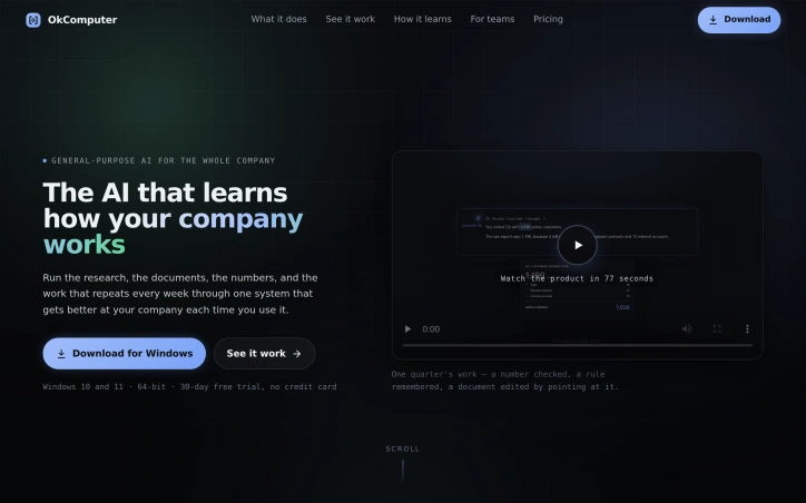

Productivity
O
Ok Computer

Corporate AI adoption remains stuck. Despite massive investments in artificial intelligence tools, most employees either ignore them or limit themselves to trivial tasks like social media drafts. The disconnect stems from two fundamental gaps: the absence of AI systems built for actual office work, and user confusion about how to employ them effectively. OkComputer addresses both problems head-on by building a workspace designed around how companies actually work rather than how chatbots interact. It's positioned as a general-purpose AI harness for professionals, handling research, documents, data analysis, planning, and operations within a single cohesive environment. Rather than forcing users to learn new interfaces for each task, the system presents familiar chat and document editing experiences alongside dedicated project organization and cloud agent infrastructure. The product's defining feature is its Company Brain: a shared organizational memory that captures policies, definitions, stylistic preferences, and accumulated knowledge. Unlike traditional AI memory systems, this learns continuously from corrections and decisions made by the team. When someone clarifies how revenue is calculated, where a billing export consistently errs, or what house style the company uses for memos, the system records these rules and applies them to future work without repeated explanation. This transforms AI from a tool that forgets each conversation into one that genuinely understands the organization's context. The scope of work OkComputer handles is notably broad. It manages market research and competitor analysis, reviews and redlines contracts, builds financial close packs and forecasts, drafts quarterly planning documents, generates weekly reports, triages email, and can schedule recurring work to run unattended. More importantly, it doesn't just describe how work might be done: it reads files, connects to systems, builds actual documents, verifies its own output, and can execute tasks autonomously. This moves it beyond the chatbot category into genuine infrastructure. The architecture supports collaborative use, with multiple team members working simultaneously within the same workspace. The system improves visibly over time as it absorbs organizational context, creating a feedback loop where each month's answers build on insights from prior months. OkComputer runs on Windows with a 30-day free trial. The company positions this equally for corporate teams and individual professionals, noting the system delivers value across both use cases.

OkComputer preview

Key features

  • Company Brain: Shared organizational memory that learns continuously from team corrections and applies accumulated knowledge to future work
  • Unified Workspace: Combines chat, document editing, project organization, and cloud agent infrastructure in a single environment
See full listing
Where Is This Place

Finding a location from a photo should be straightforward, but current solutions disappoint. Google Lens returns visually similar but geographically wrong results, general chatbots confidently pinpoint places without revealing their reasoning, and once GPS data vanishes, the photo becomes a mystery. Where Is This Place addresses this friction by turning photo location identification into a transparent, verifiable process. The service accepts any image without requiring an account or signup. Users upload a photo, screenshot, or paste directly, and receive ranked candidate locations within approximately 30 seconds. The product's core differentiation lies in its commitment to reasoning transparency. Rather than offering a single confident answer, it displays the top three candidate places alongside the visual evidence that led to each ranking: architectural features, street signs, landscape characteristics, and infrastructure details. Each analysis includes a confidence label that acknowledges the limits of what the image can support, deliberately avoiding false GPS-level precision. The interface separates candidate locations from verified pins, making clear the distinction between the AI identifying a place as a likely match and having definitive evidence for an exact location. This distinction matters for users who need trustworthy answers rather than speculative ones. Users can inspect unedited model outputs, view source photos with their original licenses and documented coordinates, and verify conclusions independently on maps. The product publishes reproducible production runs rather than handwritten demos, with file hashes and independent ground-truth checks retained in reports. The platform extends beyond geolocation into privacy protection. A browser-based EXIF viewer allows users to inspect their own photo metadata before sharing, and a metadata removal tool addresses the flip side of the problem: preventing others from extracting location data from personal photos. On the free tier, users receive five analyses per week without cost. Uploaded photos are deleted within 24 hours and never used for model training. An optional paid tier unlocks deeper evidence such as exact pins and Street View comparisons when the underlying analysis supports that level of precision, though specific pricing is not disclosed. Where Is This Place targets photographers, travelers, researchers, and anyone with photos of unknown origin. The emphasis on explainable results and privacy protection positions it directly against generic AI image analysis tools, appealing to users who want to understand the reasoning behind answers, not just the answers themselves.


Geo-tools
�
曾大发

Finding a location from a photo should be straightforward, but current solutions disappoint. Google Lens returns visually similar but geographically wrong results, general chatbots confidently pinpoint places without revealing their reasoning, and once GPS data vanishes, the photo becomes a mystery. Where Is This Place addresses this friction by turning photo location identification into a transparent, verifiable process. The service accepts any image without requiring an account or signup. Users upload a photo, screenshot, or paste directly, and receive ranked candidate locations within approximately 30 seconds. The product's core differentiation lies in its commitment to reasoning transparency. Rather than offering a single confident answer, it displays the top three candidate places alongside the visual evidence that led to each ranking: architectural features, street signs, landscape characteristics, and infrastructure details. Each analysis includes a confidence label that acknowledges the limits of what the image can support, deliberately avoiding false GPS-level precision. The interface separates candidate locations from verified pins, making clear the distinction between the AI identifying a place as a likely match and having definitive evidence for an exact location. This distinction matters for users who need trustworthy answers rather than speculative ones. Users can inspect unedited model outputs, view source photos with their original licenses and documented coordinates, and verify conclusions independently on maps. The product publishes reproducible production runs rather than handwritten demos, with file hashes and independent ground-truth checks retained in reports. The platform extends beyond geolocation into privacy protection. A browser-based EXIF viewer allows users to inspect their own photo metadata before sharing, and a metadata removal tool addresses the flip side of the problem: preventing others from extracting location data from personal photos. On the free tier, users receive five analyses per week without cost. Uploaded photos are deleted within 24 hours and never used for model training. An optional paid tier unlocks deeper evidence such as exact pins and Street View comparisons when the underlying analysis supports that level of precision, though specific pricing is not disclosed. Where Is This Place targets photographers, travelers, researchers, and anyone with photos of unknown origin. The emphasis on explainable results and privacy protection positions it directly against generic AI image analysis tools, appealing to users who want to understand the reasoning behind answers, not just the answers themselves.

Where Is This Place preview

Key features

  • Photo Upload Analysis: Users can upload any image to identify its location without requiring an account or signup.
  • Transparent Reasoning: Top three candidate locations are displayed alongside visual evidence like architectural features and street signs that support each ranking.
See full listing
TonesMatch

Matching the tone of a legendary guitar riff requires more than inspiration—it demands knowing the exact amp settings, pickup position, and signal chain used in the original recording. TonesMatch addresses this challenge with a database of over 13,000 community-researched guitar tones and a system that adapts settings to individual equipment configurations. The platform targets guitarists and bass players of all skill levels who want to replicate professional tones on their own gear, from bedroom practitioners to working musicians. What distinguishes TonesMatch from generic tone-advice resources is its commitment to real data. Rather than using AI to conjure plausible-sounding settings, the service catalogs tones from documented studio recordings and rig rundowns, with confidence scores tied to research sources. This prevents the common trap of AI-generated hallucinations: every amp setting the platform recommends actually exists on the specified amplifier, with correct preset names and parameter ranges. The product's adaptive intelligence recognizes that a Marshall Plexi and a Yamaha modeling amp respond differently to the same settings. TonesMatch profiles gear characteristics—distinguishing between tube and modeling amplifiers, single-coil and humbucker pickups, and 12 cabinet voicings—then recalculates recommendations for each user's specific equipment. The underlying database includes 2,000+ profiled guitars, 1,500+ amps, and 879 pedals across more than 1,000 brands, ensuring compatibility with both boutique and mainstream gear. The workflow is designed for speed. Users browse tones free, select a song, input their gear configuration, and receive settings in approximately 30 seconds. The interface highlights trending tones—this week's most-matched classic riffs and solos—giving users a sense of community activity and popular targets. For guitarists tired of trial-and-error tone chasing or struggling to translate YouTube rig videos to their own equipment, TonesMatch offers a data-driven alternative. By replacing speculation with researched settings calibrated to individual gear, it removes friction from a process that traditionally required either extensive experimentation or technical knowledge few players possess. The emphasis on real gear data and actual amp parameters separates it from more speculative AI tone-matching approaches flooding the market.


Music-generation
A
Audio AI

Matching the tone of a legendary guitar riff requires more than inspiration—it demands knowing the exact amp settings, pickup position, and signal chain used in the original recording. TonesMatch addresses this challenge with a database of over 13,000 community-researched guitar tones and a system that adapts settings to individual equipment configurations. The platform targets guitarists and bass players of all skill levels who want to replicate professional tones on their own gear, from bedroom practitioners to working musicians. What distinguishes TonesMatch from generic tone-advice resources is its commitment to real data. Rather than using AI to conjure plausible-sounding settings, the service catalogs tones from documented studio recordings and rig rundowns, with confidence scores tied to research sources. This prevents the common trap of AI-generated hallucinations: every amp setting the platform recommends actually exists on the specified amplifier, with correct preset names and parameter ranges. The product's adaptive intelligence recognizes that a Marshall Plexi and a Yamaha modeling amp respond differently to the same settings. TonesMatch profiles gear characteristics—distinguishing between tube and modeling amplifiers, single-coil and humbucker pickups, and 12 cabinet voicings—then recalculates recommendations for each user's specific equipment. The underlying database includes 2,000+ profiled guitars, 1,500+ amps, and 879 pedals across more than 1,000 brands, ensuring compatibility with both boutique and mainstream gear. The workflow is designed for speed. Users browse tones free, select a song, input their gear configuration, and receive settings in approximately 30 seconds. The interface highlights trending tones—this week's most-matched classic riffs and solos—giving users a sense of community activity and popular targets. For guitarists tired of trial-and-error tone chasing or struggling to translate YouTube rig videos to their own equipment, TonesMatch offers a data-driven alternative. By replacing speculation with researched settings calibrated to individual gear, it removes friction from a process that traditionally required either extensive experimentation or technical knowledge few players possess. The emphasis on real gear data and actual amp parameters separates it from more speculative AI tone-matching approaches flooding the market.

TonesMatch preview

Key features

  • Community-Researched Database: Over 13,000 documented guitar tones from studio recordings and rig rundowns
  • Adaptive Gear Profiling: Settings automatically recalculated for individual equipment including 2,000+ guitars, 1,500+ amps, and 879 pedals
See full listing
Best SOCKS5 Proxy Providers 2026 – Tested & Ranked

Organizations selecting SOCKS5 proxy infrastructure face a fragmented market where vendor claims often lack independent verification. This comparison site addresses that gap by benchmarking major providers against standardized criteria rather than relying on marketing materials. The platform targets enterprises and mid-market teams conducting web scraping, data collection, or testing operations where proxy selection directly impacts both cost and reliability. It also serves developers and agencies evaluating solutions at various price points, from budget options under $2 per gigabyte to premium services at $8+ per gigabyte. What distinguishes this resource is its commitment to independent testing methodology. Rather than publishing vendor-supplied numbers, the site conducts its own benchmarks across 180 test runs per provider, measuring success rates, latency from multiple geographic probes (Frankfurt, Ashburn, Singapore), and throughput. The scoring framework weights five dimensions—success rate at 35 percent, latency and throughput at 25 percent, cost per IP/GB at 20 percent, pool quality at 12 percent, and support tooling at 8 percent. This transparency allows readers to understand trade-offs between competing priorities. The comparison table presents practical specifications: pool sizes ranging from 2 million to 150 million IPs, latency from 620 milliseconds to 1,300 milliseconds, and supported protocols. Scores cluster between 8.2 and 9.8, suggesting narrow performance differentials at the top tier. Top-ranked providers like Oxylabs and Bright Data offer pools exceeding 100 million IPs with sub-700 millisecond latency, while budget alternatives like IPRoyal deliver comparable SOCKS5 support at 1,100 milliseconds latency for fraction-of-the-price positioning. The site distinguishes datacenter SOCKS5 (for speed and consistency) from residential options, addressing different use cases. Provider reviews are keyed to specific personas—scraping teams needing scale get Oxylabs, agencies requiring granular targeting get Bright Data, and cost-conscious mid-market teams get Smartproxy. One notable gap: the site discloses affiliate relationships but doesn't articulate how those relationships are managed or whether they influence editorial placement. The methodology section mentions measuring HTTP 2xx success rates as-is without context about whether this metric equally applies across providers supporting different protocol stacks. For teams with limited proxy expertise, this resource reduces decision friction through structured comparison. The independent benchmarking claim is substantive, though readers should verify that test scenarios match their specific workload requirements—latency from Frankfurt probes doesn't necessarily predict performance for US-centric operations, for example.


Content-management-systems
V
VPS Rated

Organizations selecting SOCKS5 proxy infrastructure face a fragmented market where vendor claims often lack independent verification. This comparison site addresses that gap by benchmarking major providers against standardized criteria rather than relying on marketing materials. The platform targets enterprises and mid-market teams conducting web scraping, data collection, or testing operations where proxy selection directly impacts both cost and reliability. It also serves developers and agencies evaluating solutions at various price points, from budget options under $2 per gigabyte to premium services at $8+ per gigabyte. What distinguishes this resource is its commitment to independent testing methodology. Rather than publishing vendor-supplied numbers, the site conducts its own benchmarks across 180 test runs per provider, measuring success rates, latency from multiple geographic probes (Frankfurt, Ashburn, Singapore), and throughput. The scoring framework weights five dimensions—success rate at 35 percent, latency and throughput at 25 percent, cost per IP/GB at 20 percent, pool quality at 12 percent, and support tooling at 8 percent. This transparency allows readers to understand trade-offs between competing priorities. The comparison table presents practical specifications: pool sizes ranging from 2 million to 150 million IPs, latency from 620 milliseconds to 1,300 milliseconds, and supported protocols. Scores cluster between 8.2 and 9.8, suggesting narrow performance differentials at the top tier. Top-ranked providers like Oxylabs and Bright Data offer pools exceeding 100 million IPs with sub-700 millisecond latency, while budget alternatives like IPRoyal deliver comparable SOCKS5 support at 1,100 milliseconds latency for fraction-of-the-price positioning. The site distinguishes datacenter SOCKS5 (for speed and consistency) from residential options, addressing different use cases. Provider reviews are keyed to specific personas—scraping teams needing scale get Oxylabs, agencies requiring granular targeting get Bright Data, and cost-conscious mid-market teams get Smartproxy. One notable gap: the site discloses affiliate relationships but doesn't articulate how those relationships are managed or whether they influence editorial placement. The methodology section mentions measuring HTTP 2xx success rates as-is without context about whether this metric equally applies across providers supporting different protocol stacks. For teams with limited proxy expertise, this resource reduces decision friction through structured comparison. The independent benchmarking claim is substantive, though readers should verify that test scenarios match their specific workload requirements—latency from Frankfurt probes doesn't necessarily predict performance for US-centric operations, for example.

Best SOCKS5 Proxy Providers 2026 – Tested & Ranked preview

Key features

  • Independent Benchmarking: Conducts 180 test runs per provider measuring success rates, latency, and throughput
  • Multi-Dimensional Scoring: Weights five criteria including success rate (35%), latency/throughput (25%), cost (20%), pool quality (12%), and support tooling (8%)
See full listing
SEO Automation Hub

Scattered SEO data across multiple platforms has become a critical pain point for agencies and internal teams trying to move from analysis to implementation. SEO Automation Hub addresses this by consolidating audits, competitor intelligence, and content generation into a single operational workspace designed around clear workflows rather than dashboard reporting. The platform targets three distinct user groups: agencies looking to standardize client deliverables, independent consultants seeking to demonstrate methodology and control, and internal teams needing alignment between SEO, content, and development functions. Each gets a workspace structured around a four-step progression: acquiring signals from connected sources, evaluating them to separate genuine urgencies from noise, assigning insights as concrete tasks with clear ownership, and measuring the results of interventions. What distinguishes this product is its emphasis on actionability over metrics accumulation. The interface promises a readable path for decision-makers and executors alike, moving past the typical export-and-spreadsheet model that plagues multi-platform SEO work. The technical audit surfaces Lighthouse metrics, critical pages, and prioritized improvements in a structured roadmap. Google Search Console integration lifts query data, page performance, and competitive signals without requiring separate tabs and manual consolidation. The competitor analysis module goes beyond feature parity comparisons to identify strategic gaps and market positioning opportunities. Content generation gets particular attention here. Rather than disconnected AI writing, the platform generates briefs, on-page structures, and full articles calibrated to the domain's existing performance and market context. Topic research feeds into this, uncovering trend-worthy subjects and backlink opportunities that convert to editorial tasks. The work management layer—labeled Pipeline SEO—bundles all of this into weekly workflows with prioritization logic based on impact and effort. The product clearly positions itself for teams that have moved beyond one-off audits and now operate SEO as a continuous discipline with multiple stakeholders. An internal team might use this to keep content creators and developers aligned on shared SEO priorities. A consultant could use it to show clients not just what's broken but the method for fixing it systematically. An agency could scale delivery across clients without losing consistency. The platform offers a seven-day free trial with limited reporting access, suggesting a freemium model, though specific pricing tiers are not detailed in available materials. This approach lowers barrier to evaluation while funneling users toward paid tiers as project scope grows.

Scattered SEO data across multiple platforms has become a critical pain point for agencies and internal teams trying to move from analysis to implementation. SEO Automation Hub addresses this by consolidating audits, competitor intelligence, and content generation into a single operational workspace designed around clear workflows rather than dashboard reporting. The platform targets three distinct user groups: agencies looking to standardize client deliverables, independent consultants seeking to demonstrate methodology and control, and internal teams needing alignment between SEO, content, and development functions. Each gets a workspace structured around a four-step progression: acquiring signals from connected sources, evaluating them to separate genuine urgencies from noise, assigning insights as concrete tasks with clear ownership, and measuring the results of interventions. What distinguishes this product is its emphasis on actionability over metrics accumulation. The interface promises a readable path for decision-makers and executors alike, moving past the typical export-and-spreadsheet model that plagues multi-platform SEO work. The technical audit surfaces Lighthouse metrics, critical pages, and prioritized improvements in a structured roadmap. Google Search Console integration lifts query data, page performance, and competitive signals without requiring separate tabs and manual consolidation. The competitor analysis module goes beyond feature parity comparisons to identify strategic gaps and market positioning opportunities. Content generation gets particular attention here. Rather than disconnected AI writing, the platform generates briefs, on-page structures, and full articles calibrated to the domain's existing performance and market context. Topic research feeds into this, uncovering trend-worthy subjects and backlink opportunities that convert to editorial tasks. The work management layer—labeled Pipeline SEO—bundles all of this into weekly workflows with prioritization logic based on impact and effort. The product clearly positions itself for teams that have moved beyond one-off audits and now operate SEO as a continuous discipline with multiple stakeholders. An internal team might use this to keep content creators and developers aligned on shared SEO priorities. A consultant could use it to show clients not just what's broken but the method for fixing it systematically. An agency could scale delivery across clients without losing consistency. The platform offers a seven-day free trial with limited reporting access, suggesting a freemium model, though specific pricing tiers are not detailed in available materials. This approach lowers barrier to evaluation while funneling users toward paid tiers as project scope grows.

SEO Automation Hub preview

Key features

  • Technical Audit: Surfaces Lighthouse metrics, critical pages, and prioritized improvements in a structured roadmap.
  • Google Search Console Integration: Lifts query data, page performance, and competitive signals without requiring separate tabs.
See full listing